'Gardenopolis - Helping you to grow green spaces in urban places'
Target Users
Gardenopolis is an online educational resource that aims to make gardening accessible and pleasurable to people with little or no prior knowledge, particularly to the under 35’s who are defined by a lack of time and space, both indoors and outside.
Purpose
The site is aimed at people both with and without formal outdoor gardens, to inspire then to grown plants, flowers and vegetables in urban spaces. The digital platform was inspired by my own passion for urban gardening and created in response to ta brief set for my 'Information Architecture' coursework, as part of my MSc in 'Human Computer Interaction Design' at City, University of London.
Challenges
The main challenge has been to organise a set of online video tutorials, each accompanied by a step by step guide, shopping list, and importantly plant care and information, that can be searched according to a wide variety of user needs that vary according to skill, experience, type of garden or space available, budget and seasonality.
Project Requirements
1. To conduct contextual research & interviews
2. To create a set of requirements for the site
3. To design a set of interactive prototypes
Wireframes
Approach
In depth interviews in situ with 3 domain experts:
1) Head buyer at one of London’s top urban garden centers
2) Horticultural expert and project manager of a lottery funded inner city gardening initiative.
3) Marketing executive who volunteers at a local communal garden through her work.
What became apparent is the popularity of food and “growing your own” as a major incentive to get people gardening. The head buyer revealed that urban gardeners’ queries are mostly shaped by a particular preference followed by spatial constraints such as location, container type or the availability of light, combined with seasonality and skill level. This was supported by the marketing expert who exclaimed, “I just want to grow a few carrots on my balcony without wading through loads of information”.
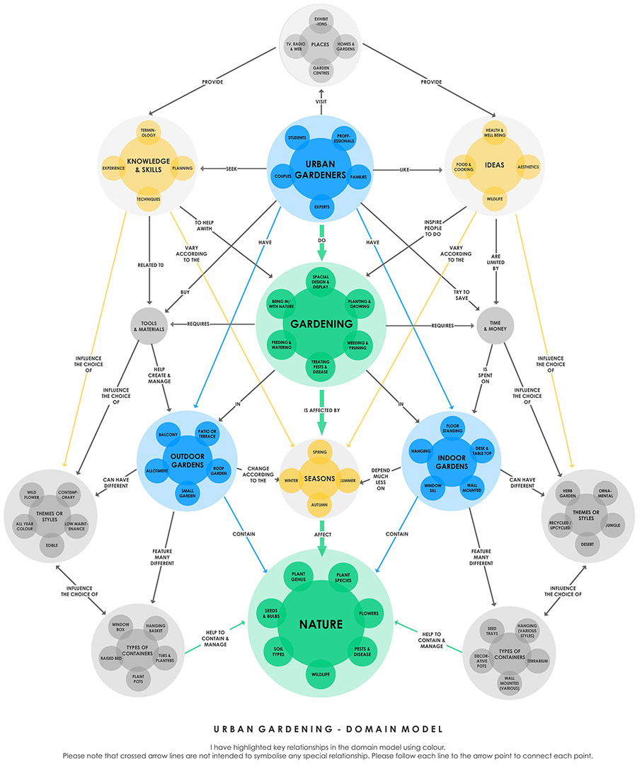
She later added, “I basically want to know what to do, when & how”, hence the desire for knowledge, ideas and skills clearly revolves around time, notably seasons in the domain model. A defining scheme that also emerged is that there are two distinct audiences, indoor gardeners and outdoor gardeners. According to Rosenfeld, L. & Morville, P. “This type of scheme works well if there is value in customizing the content for each audience [...] that invites users to self-identify” (p.110, 2007). In this case the categories are the same but the taxonomies are very different so there is huge value in presenting audience based search results.
Domain Model - Site Map - User Flow

User Flow
Domain Model
This domain model was a vital tool for conceptualising categories, taxonomies and metadata. I chose a hybrid navigation system, that is both task and topic based with multiple sets of filters, what Spencer (2010) refers to as an ‘ambiguous classification scheme’. As the domain model shows, there are contrasting clusters of attributes that are mirrored on either side of the model, defined in relation to two key audiences.
Site Map
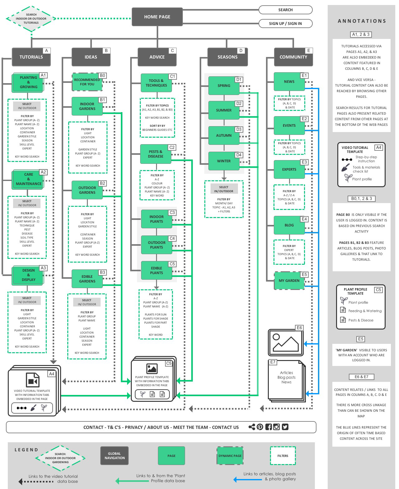
Dan Brown argues that, “Sitemaps are content! [...] linking is what gives content structure beyond itself”(2011, p.96).The sitemap underscores this point as it was designed to enable users to search and discover three main types of content, video tutorials, plant profiles & articles, the linking of which is as much a feature as the filtering of it is.
The challenge has been threefold. Firstly gardening features multiple taxonomies, notably of plant names, tools and techniques, that few people are familiar with, a fact that was underscored by a very inconclusive open card sort I did with 9 people. Secondly, there are two distinct but overlapping audiences, indoor and outdoor gardeners. Thirdly, the way in which people formulate queries varies enormously.
All three factors are further exacerbated by the vastness of gardening as a domain. As recommended by Brown (2011) I did a lot of building up and tearing down (p.82) of my domain model and site map in tandem. Importantly, Spencer warns that task based systems can become very chaotic (2010, p 166) which is why I decided to assign gardening tasks and tutorials to three main navigation categories, Planting & Growing, Care & Maintenance and Design & Display.
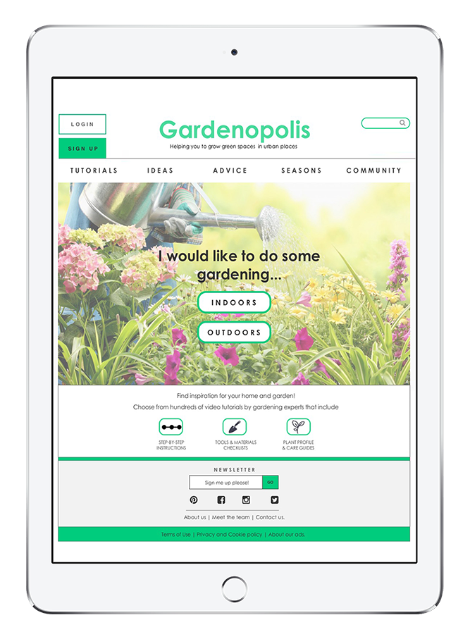
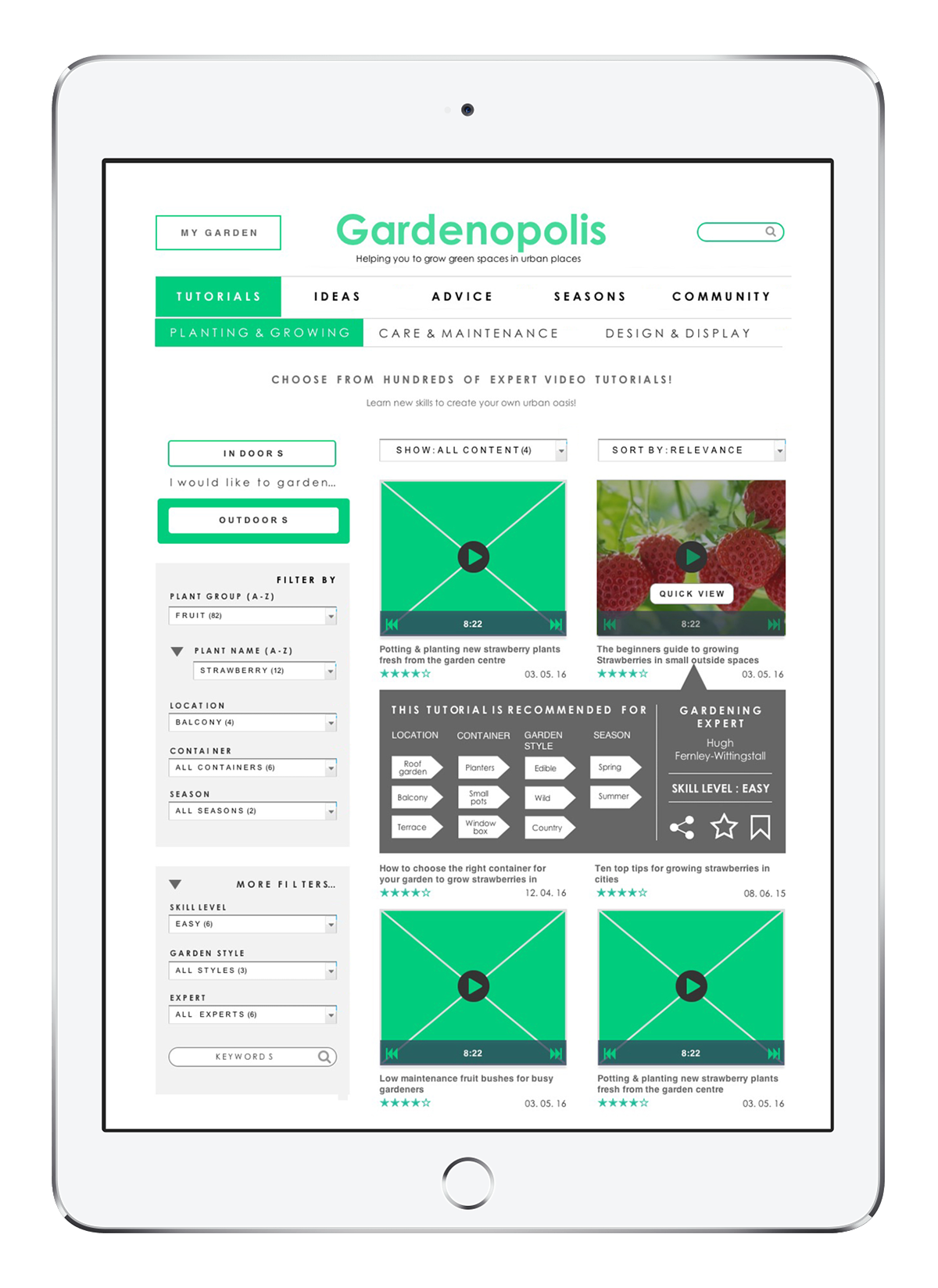
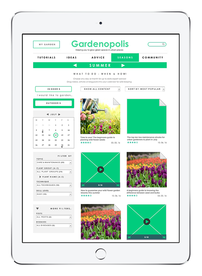
These groupings were then assigned key filters, listed on the site map in hierachical order, as seen in W2 & W3. Furthermore, the content of these filters is defined by an audience based filter tab that acts like a preset. As the homepage wireframe W1 demonstrates, users are required to formulate the answer to a simple question that will define their understanding of the site. Users can alternate freely but they have to choose one or the other to yield the best user experience.
Task Flow Diagram
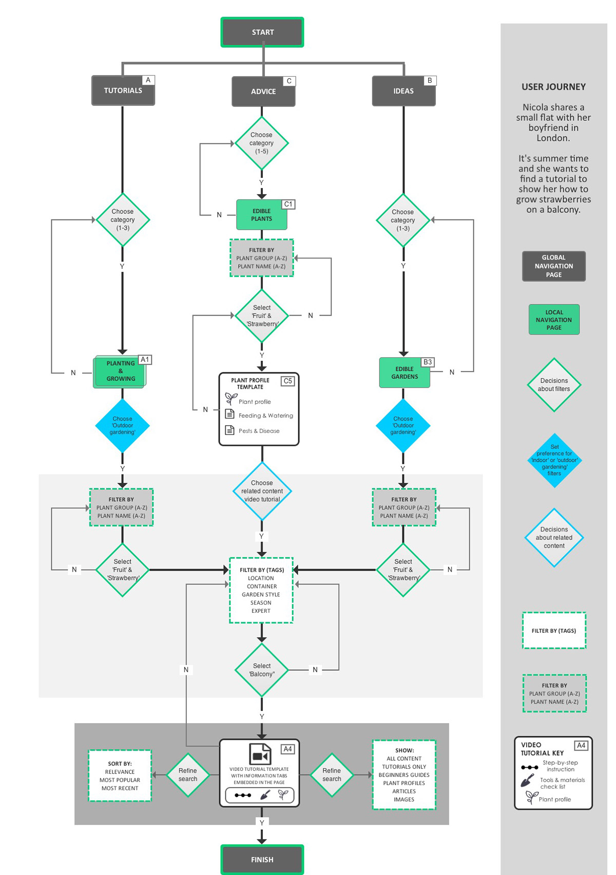
Spencer (2010) recommends focused entry points for large websites where it’s not “possible to ‘organise’ content in a single way that will suit all users [...] because they have different information needs and different levels of experience with the topic.” (p.203).
This underscores the rationale behind the creation of my global navigation categories, notably Tutorials, Ideas, Advice, Seasons & Community designed to mirror four different potential information seeking agendas. For example, some users might formulate queries based on the need for a particular skill, some a particular problem, others seek inspiration.
Alternatively, some users can’t formulate a query at all whilst no information is relevant unless it’s based in real time for others. As a result of this observation, the entry points featured in the user journey, combined with the wireframe in Appendix D (W2), which suggests a potential route based on the current season, month or day, serve to highlight multiple entry points that link both to and from the content on the site map.
In response to what Wodtke, C. & Govella, A. (2007) refer to as ‘associative navigation with metadata’ (p. 209) I added two formatting filters, ‘Sort by X, Y & Z’, and ‘Show all / X, Y, Z’, that are be based on time, content type or topic, such as’ Beginners Guides’ to name a few, as detailed in the user journey in Appendix C. This enables users to further refine content once the right topic or task is located.
Annotated Wireframes
Home Page
Tutorial Search
Video Tutorial Page - Sample
Tutorial Search
Diagram Testing & Evaluation
First round of evaluation using paper-based prototypes with x 3 Participants
task 1
I showed the home page first and asked users to clarify what content they expected to find under each global navigation label. Tutorials (A), Ideas (B) & Advice (C) were clear but Seasons (D) & Community (E) were ambiguous. I then asked participants what they expected to happen if they clicked the indoor or outdoor buttons. All participants reported that they could not be sure whether they’d arrive at A or B, but that the distinction made sense once they navigated the site.
task 2
I asked each user to fulfil two tasks designed to test the grouping of tasks into three categories (A1, A2 & A3). The first task was to find a tutorial that shows you how to plant bulbs in window boxes. All users verbally selected ‘A’. On arriving they all questioned how the audience-based filter was determined and whether the local navigation would change if they switched the setting, and what the default is. Two users suggested a design change, that instead of having two options, just one tab that said ‘Switch to ’ might suffice.
task 3
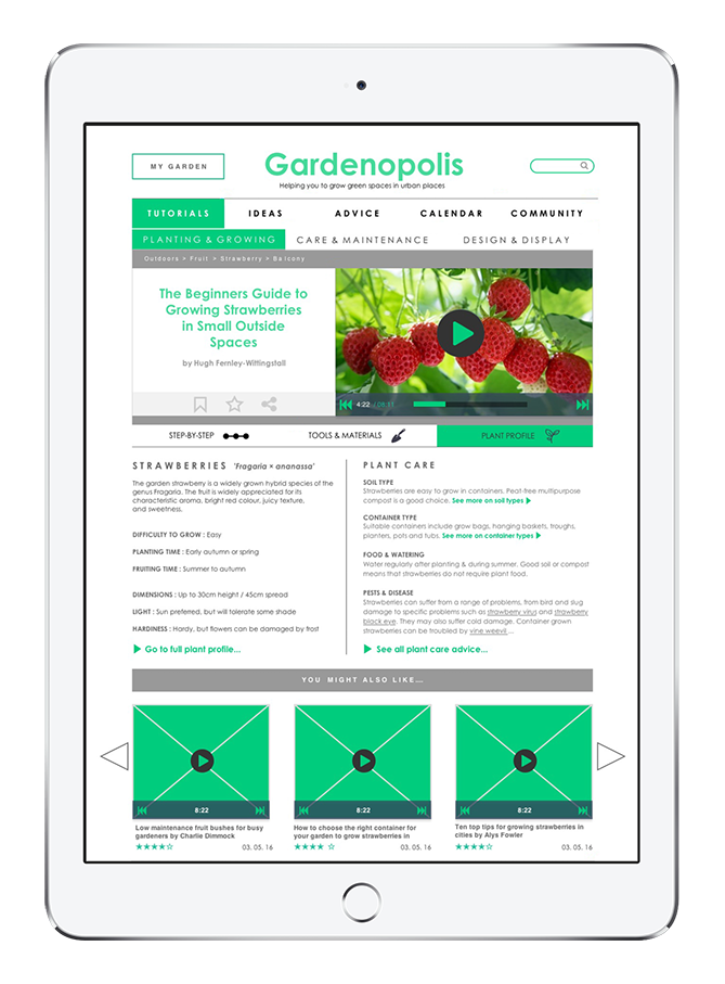
The second task was to find a tutorial that shows you how to treat a diseased plant. Two users entered the site via A, but one user entered via C. As I didn’t have the appropriate wireframe to continue I asked the participant to suggest more than one route. This resulted in all participants choosing A and successfully navigating to the ‘Care & Maintenance’ category. At the end of these tasks, I asked specific questions relating to plant profile labelling and in page navigation such as pop ups and hyperlinks in W4, as well as seeking to clarify what they understood by the order of the filters in W2 & 3.
Conclusion
Participants liked the overall layouts and filters but there was confusion around the meaning and functionality of the ‘Quick View’ label and the corresponding fly-out shown in W3. Two participants liked it, only one of which understood it as another way to select filters. The third user did not understand it at all. Ironically perhaps, no one commented that the thumbnails all have control buttons to indicate that they all have the quick view facility. I would like to explore this area of labelling and potential functionality further to ascertain whether it is the label itself that is misleading, the concept, the layout, or possibly the fact that the prototype is not interactive. Consequently, it lacks subtle indicators of state changes such as hover colour changes & pop ups etc. In hindsight an interactive prototype would have been much easier way to test the volume of filters in relation to the audience preset filter and the behaviour of the local navigation.
References
Brown, D. (2011) Communicating Design. Developing Web Site Documentation for Design and Planning. Second Edition: Berkeley, CA: New Riders, a division of Pearson Education.
Rosenfeld, L. & Morville, P. (2007) Information Architecture for the World Wide Web. Cambridge: O’Reilly. Spencer, D. (2010) A Practical Guide to Information Architecture. Penarth, UL: Five Simple Steps
Wodke, C. & Govella, A. (2009) Information Architecture, Blueprints for the Web. Second Edition: Berkeley, CA: New Riders, a division of Pearson Education.
