Client
Blood Cancer UK formerly known as Bloodwise, is the UK’s leading blood cancer research charity. They fund research to improve treatment and care for people living with all types of blood cancer including leukaemia, lymphoma and myeloma and provide everyone affected by blood cancer with information they can trust, in language they can understand.
Objectives
Through their information and support services, Bloodwise empowers and connects people affected by blood cancer so that they can live their life to the full. Based on extensive research, Bloodwise decided it was time to create a digital platform to help people living with or after blood cancer that aims to achieve the following:
> To access wellness and lifestyle content, support and tools that are not available from health care providers.
> To provide peer to peer advice and guidance with user led inspirational stories and advice.
> To provide and strengthen an online community for people living with or after blood cancer.
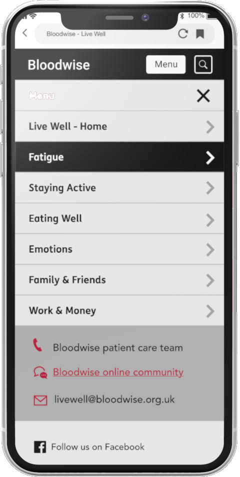

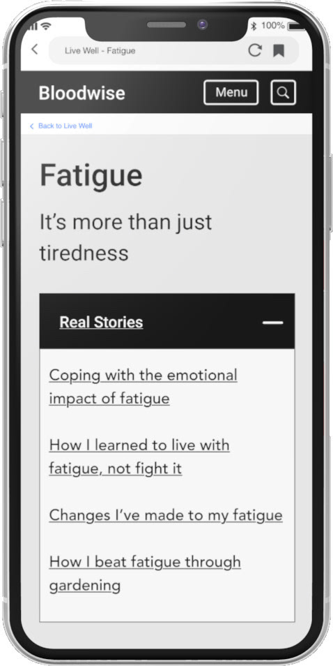
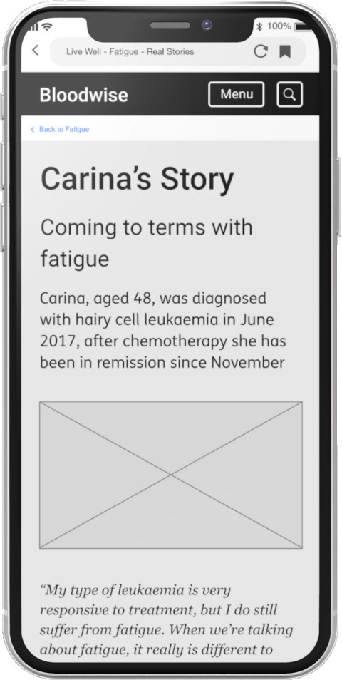
Brief
I was asked to transform a prototype for a microsite called Live Well, that was produced at the end of a 5 day design sprint, into a fully fledged digital platform that was to be built in a matter of weeks. I was asked to design "the UX" for the site and to develop a working prototype to be tested with representative users both in person and remotely, and to design the final UI for desktop, tablet and mobile. I was also asked to act as an adviser on the visual design of the site, overseeing an in-house graphic designer whilst the charity was in the early stages of negotiating a huge rebrand.
PHASE 1
1. RESEARCH
To begin with, I was asked to review a wealth of user research, including focus groups, participatory design workshops and a design sprint. I then conducted an expert review of the prototype, built in Wordpress, as the basis for starting my design work with Bloodwise.
A. Client Questions regarding the purpose of the product, core user needs & identification of KPI's
B. Research Review of Bloodwise user research conducted over one year
C. Design Sprint Analysis of the Bloodwise Live Well design sprint process & outcomes
D. Brand Review of the Bloodwise main website and social media channels
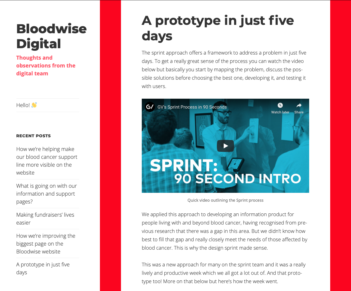
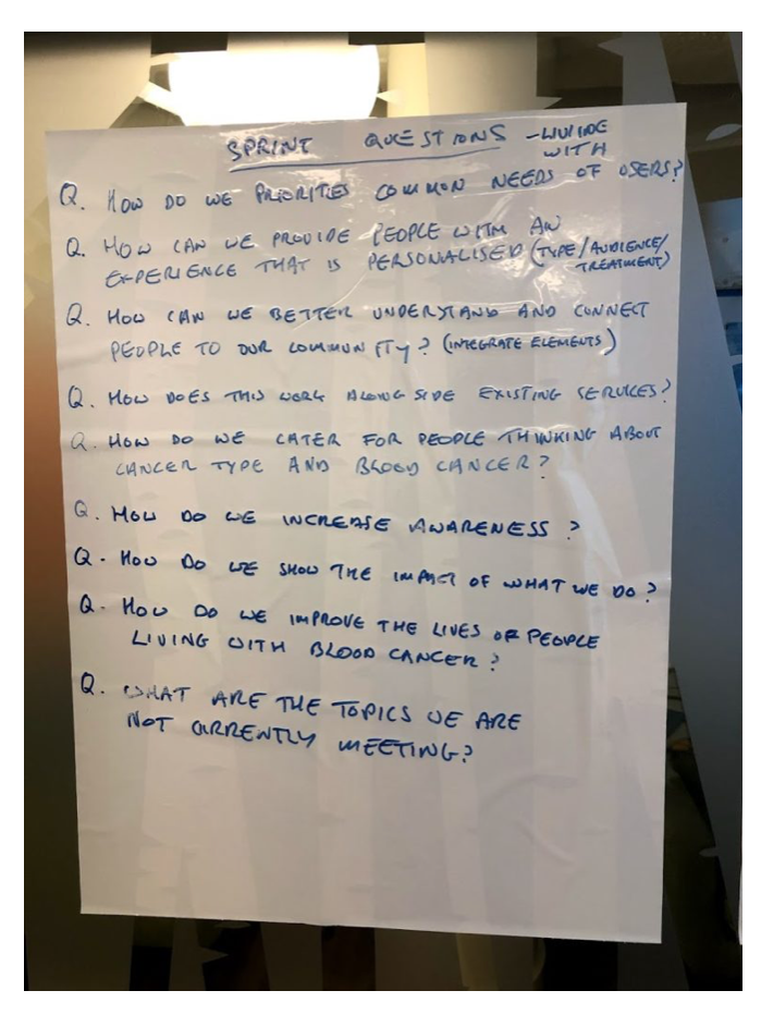
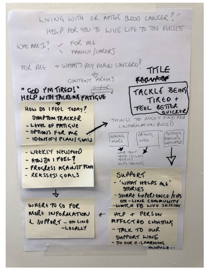
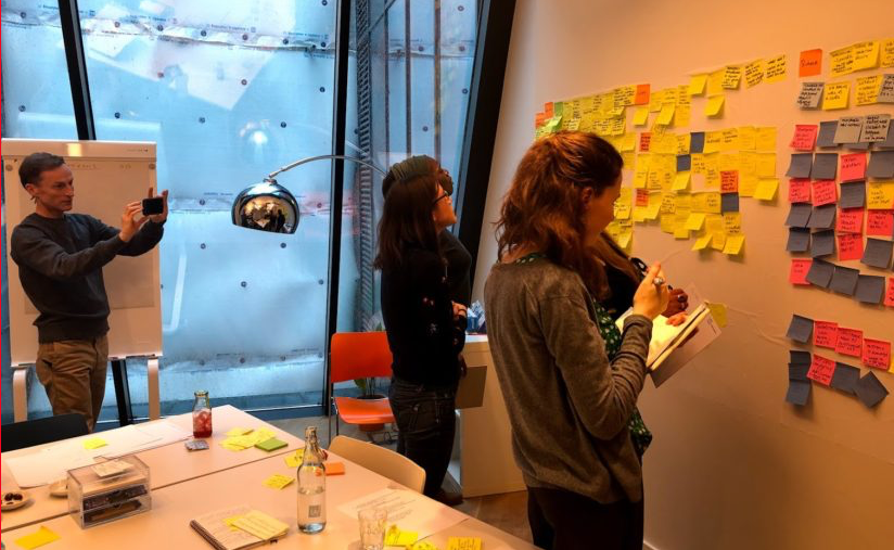
C. Live Well - 5 Day Design Sprint
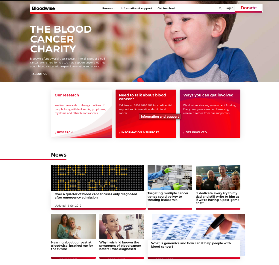

D. Brand Review of the Bloodwise main website and social media channels
2. REQUIREMENTS
Based on the above research and client questions, I created a set of requirements for the Live Well microsite in order to guide both the expert review and subsequent site redesign.
Requirements for the 'Live Well' microsite
3. EVALUATION #1
Expert Review - Planning
The expert review sought to evaluate the Bloodwise Living Well microsite prototype, as developed during the 5 day design sprint, against UX best practice. In light of the business goals stated on the Bloodwise Client Questions document, the purpose of the expert review was to understand the following:
1. How well the Living Well microsite enables users either living with, or in remission from blood cancer, to search and find helpful information related to their individual goals.
2. How well the Living Well microsite communicated information regarding self-care and self- management to users either living with, or in remission from blood cancer.
3. How well the Living Well microsite motivated users either living with, or in remission from blood cancer, to make changes to their self-care and self-management.
4. How well the Living Well microsite facilitated connections between people living with, or in remission of blood cancer.
4. PERSONAS
To do this, we looked at the site from the perspective of new and infrequent users from the two main stakeholder groups; people living with blood cancer and people in remission of blood cancer. We kept the review high level, taking into account the personas, tasks & goals.
'Live Well' Persona 1 - Person living with blood cancer
'Live Well' Persona 2 - Person in remission of blood cancer
5. EXPERT REVIEW
The 'Live Well' prototype Home Page - Designed on Sprint Day 5
Findings & Recommendations
The most apparent aspect of the Living Well microsite was the lack of navigation, and the lack of consistency between icons, labels, or what could be referred to as navigation category icons and titles, and page titles. At the point of inspection the groupings and labels were not defined or clear.
Living Well design sprint prototype home page navigation categories & labels
Affective Features
The second aspect of the site that stood out was the lack of affective design features such as positive imagery or testimonials, or persuasive design tools such as calls to action like goal setting and progress monitoring. There was no mention of a community or corresponding calls to action to join the Bloodwise forum on the homepage, so it was not apparent that the site offers connection to a wider group of experts or fellow cancer sufferers and survivors.
Layout & Visuals
The third aspect that needed to be addressed is the layout and visual design. The use of the fill colour red in is very dominant and overshadowed a lot of valuable information. The site was also icon and text heavy. Most importantly, the site requires photography or a suite of illustrations to demonstrate each category and to bring the content to life, as opposed to the heavy reliance on text, icons and a handful of stock illustrations.
DESIGN SPRINT PROTOTYPE - REVIEWED PAGES
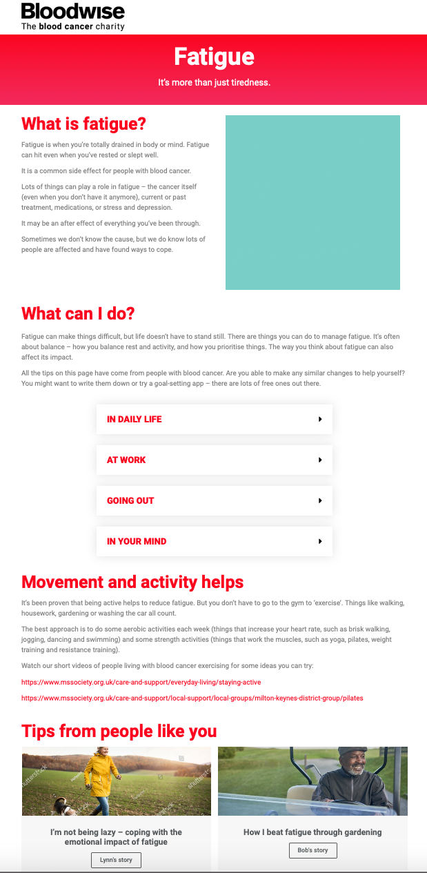

Left Image: Living Well 'Fatigue' page with stock place holder photography
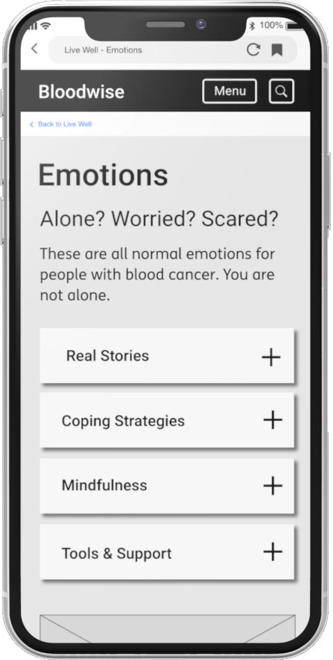
Right Image: 'Alone. Worried. Scared.' page - eventually shortened to 'Mind & Emotions'
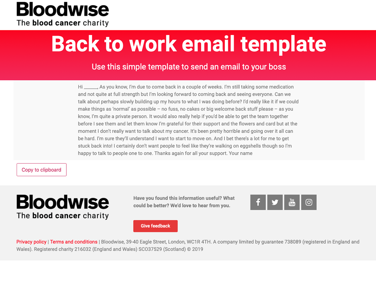
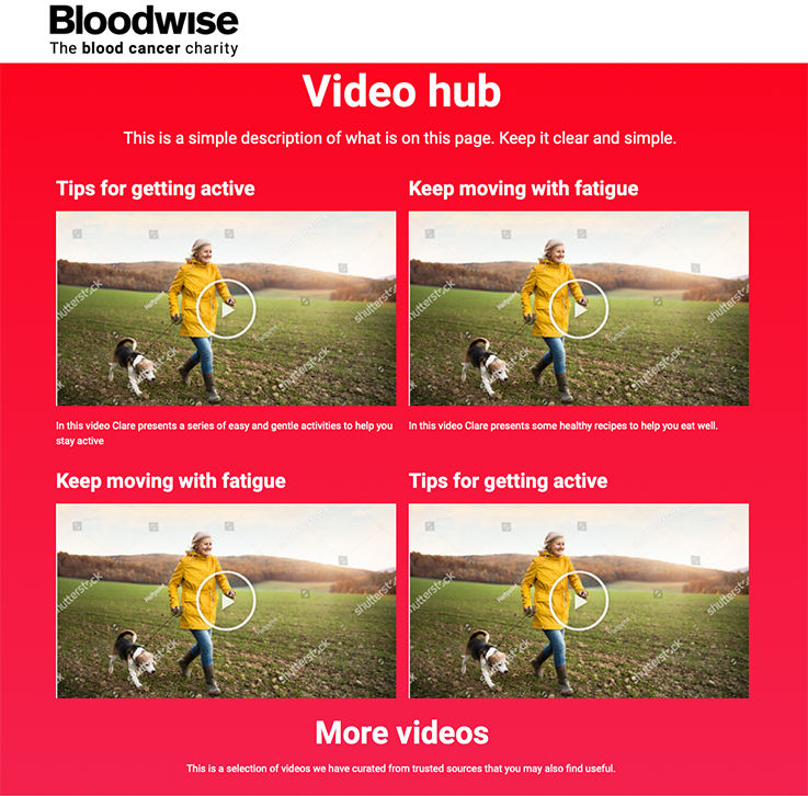
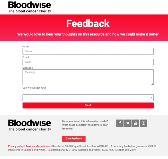
Left Image: 'Back to work email template' page which was moved to the 'Work & Money' page
Middle Image: 'Video hub' page - deleted in favour of embedding themed video content into relevant pages.
Right Image: 'Feedback email template' page - deleted in favour of embedding this into all pages.
Tools for Behaviour Change
The final and most critical part was the lack of digital tools on offer within the Live Well toolkit. I recommended encouraging repeat user interactions in the form of bookmarking and favourite options, social sharing and setting up email reminders and alerts to prompt cognitive and behavioural change on a regular basis.
Recommendations
In the long term I highly recommended designing a range of online self-care tools for people living with and in remission from blood cancer that encourage users to set goals and monitor their progress. This would help to foster more frequent interactions between users and with the Bloodwise charity with regards to using the Live Well toolkit and community, as well as disseminating valuable information to grow the charity and its work.
Conclusion
The findings & design recommendations fed directly into my sketches for the wireframes. Based on the content type and the project budget the site would be information heavy with lots of links to external service providers, as well as advice and guidance websites or apps. My job was to create a therapeutic online platform that fostered connection and community, as well as to order and contextualise relevant content to make it quickly accessible to users of the site.
PHASE 2
1. DESIGN
A. Content inventory
Not all sections of the prototype were populated with content so I requested content for all the available pages, supplied to me unformatted in basic Word documents.
At the time of the review, there was only content available for the 'Fatigue' and 'Alone. Worried. Scared' pages completed, with the 'Work & Money' section to follow later.
The content supplied was very sparse and unformatted so it required a lot of editing and visualisation, it was an unexpected part of the project that took more time than I had expected.
B. User journeys - This involved mapping the happy path for each user goals and examining the most efficient labelling and categories in order to produce the site navigation system.
2. SITE MAP
3. WIREFRAMES
I began by sketching the UI elements including the main home page navigation, the layouts for each page, as well as features, links and interaction opportunities. As the site is aimed at people with both cognitive and physical impairments, in the form of fatigue or kinaesthetic weakness from treatment, it was agreed that the site should be designed first as a tablet version, before adapting to desktop and mobile using responsive frameworks.
* Please note this case study previews a small section of Live Well pages only.*
HOME PAGE - Wireframe Version 1.0
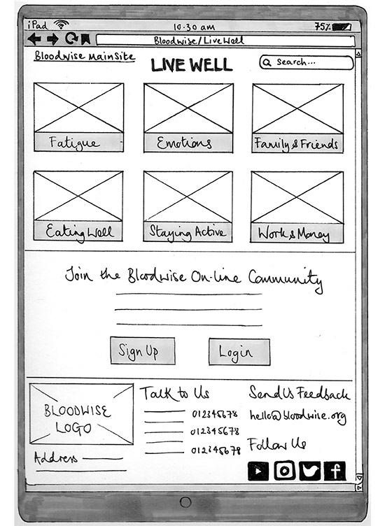
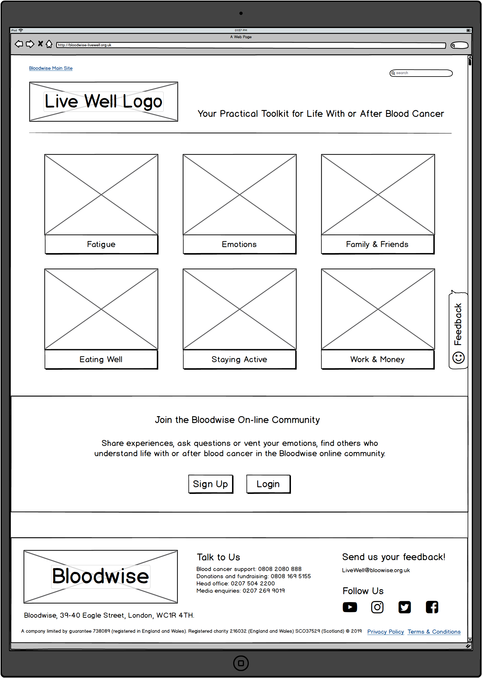
Left Image: UI Sketch for the Live Well home page including revised navigation & labels
Right Image: Sketch mocked up in Balsamiq in order to quickly create an interactive clickable prototype
The expert review emphasised how joining the 'Bloodwise On-line Community' is a key user goal, to reach out and connect with other people who are living with or after blood cancer. It was not featured on any of the Live Well prototype pages and was almost invisible so I moved to the home page, as seen in the banner below the in page navigation images and text boxes.
'FATIGUE PAGE' - Wireframe Version 1.0
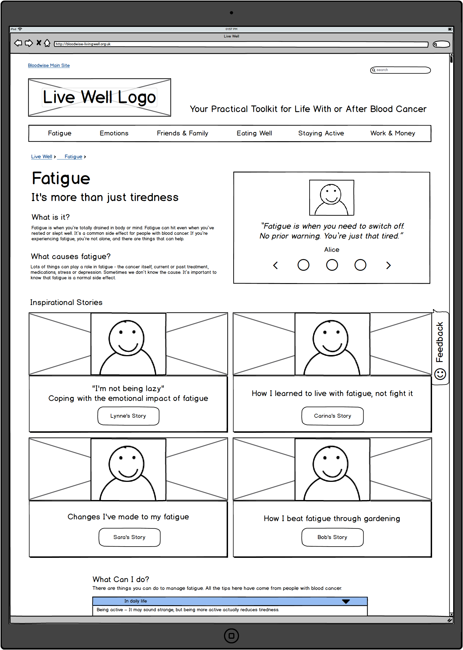
Left Image: The 'Fatigue' section features 'Inspirational Stories' by and for people living with or after blood cancer
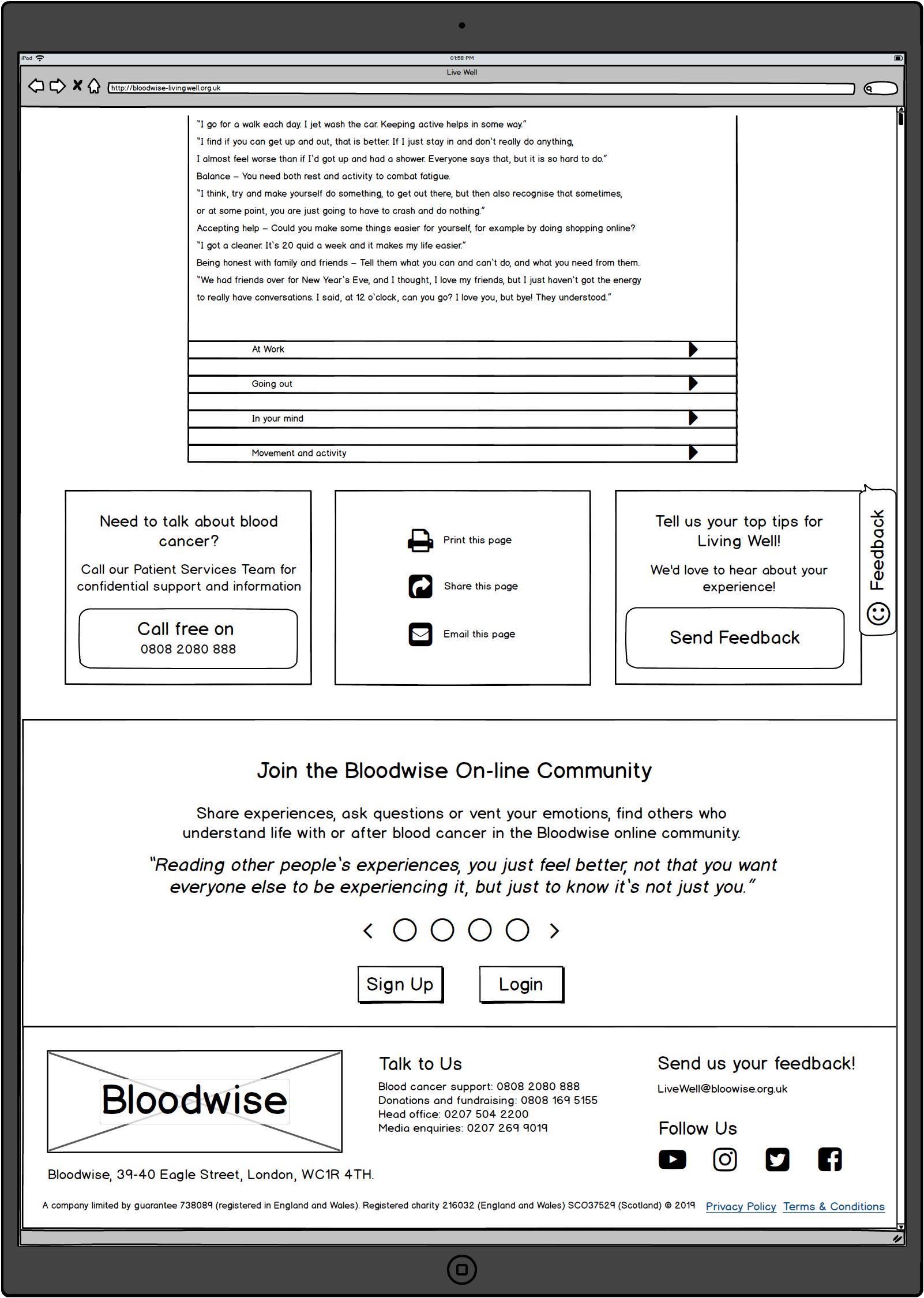
Right Image: And accordion menu was chosen to house detailed advice & guidance information in order to shorten the overall page length to make the information easier to scan.
The three boxes below link to a telephone advice line, social media channels, and user feedback pop up modal. The banner beneath links to an external page to join the Bloodwise online community forum.
Beyond reading the inspirational stories, advice and guidance, these four features are the main forms of user interaction. As the project progressed it became these features needed to be made more prominent on every page.
As part of the charity rebrand and main website redesign, I strongly recommend that users to be able to sign up to the Bloodwise community forum without leaving the Live Well microsite, and that this was something to emphasise and improve in terms of on boarding and integration from both the main website and micro sites.
'FATIGUE' > INSPIRATIONAL STORY PAGE #1- Wireframe Version 1.0
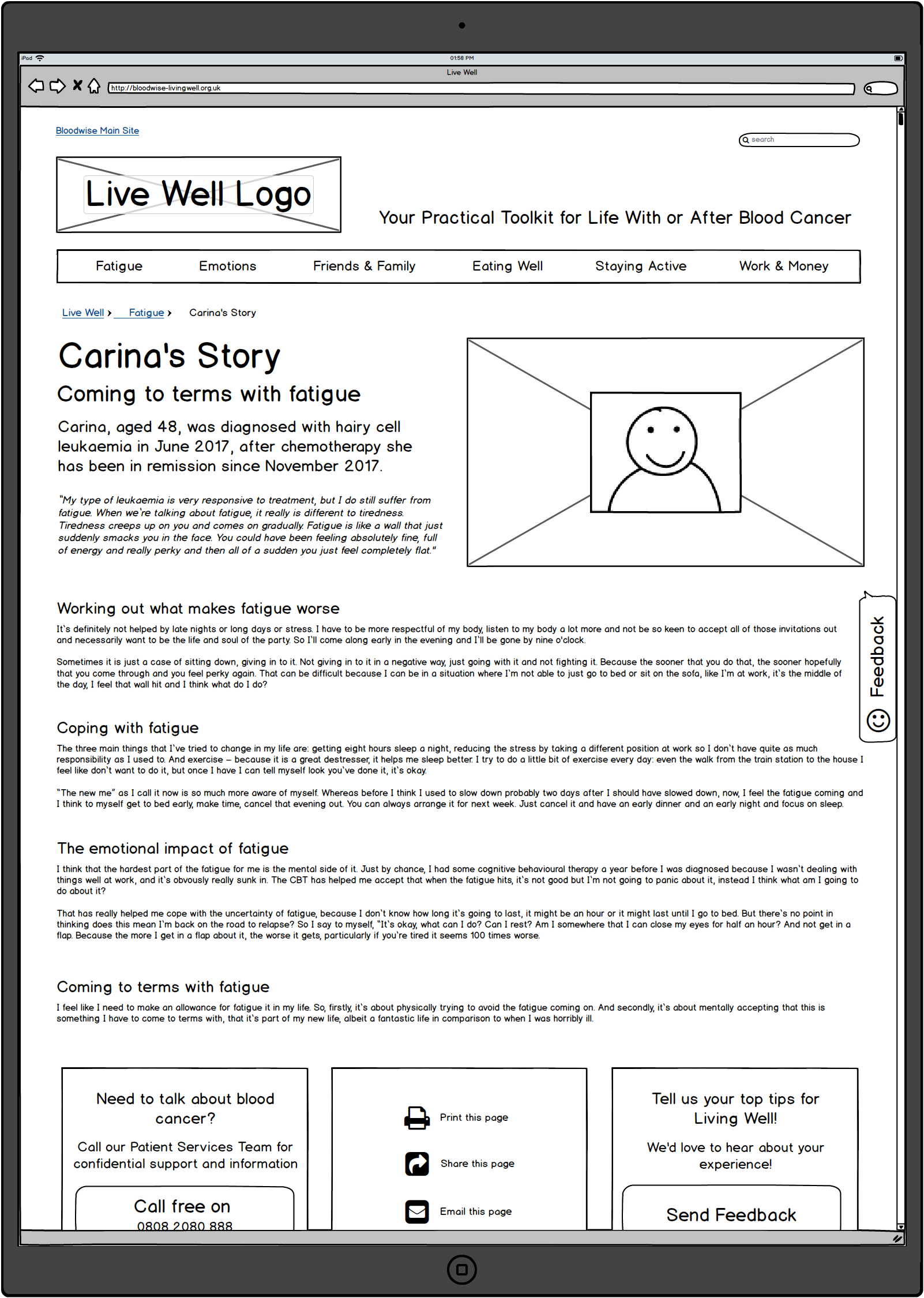
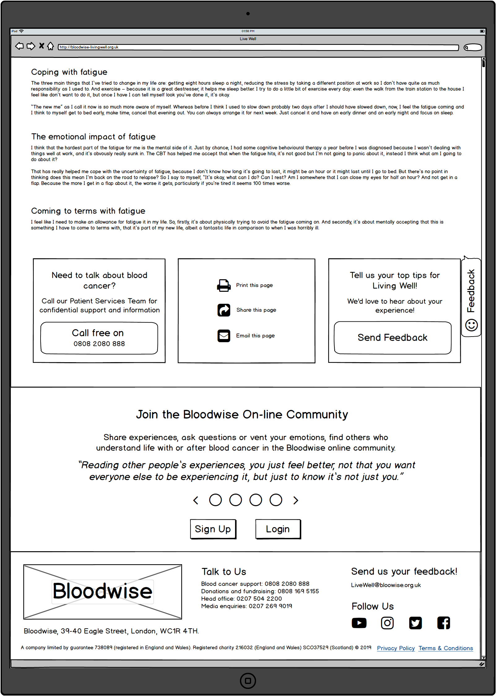
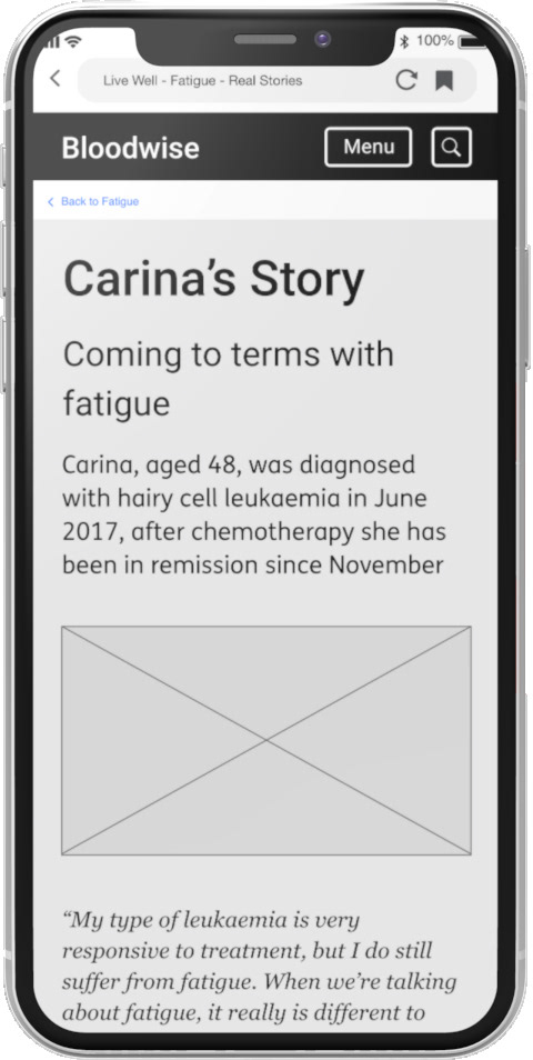
Left Image: Fatigue > Corina's Story - 'Coming to terms with fatigue'.
Right Image: Shows full page on scroll with calls to action & footer menu.
Each of the six major navigation categories featured on the home page, such as 'Fatigue', link to an advice page that features 'Inspirational Stories' by and for people living with or after blood cancer.
Bloodwise 'Live Well' research highlighted a lack of non medical lifestyle and wellbeing information and support for people living with or after blood cancer.
The stories are intended to foster peer to peer empathy and support in order to help reduce the feelings isolation and despair, as well as to inspire people to take positive changes to their lives.
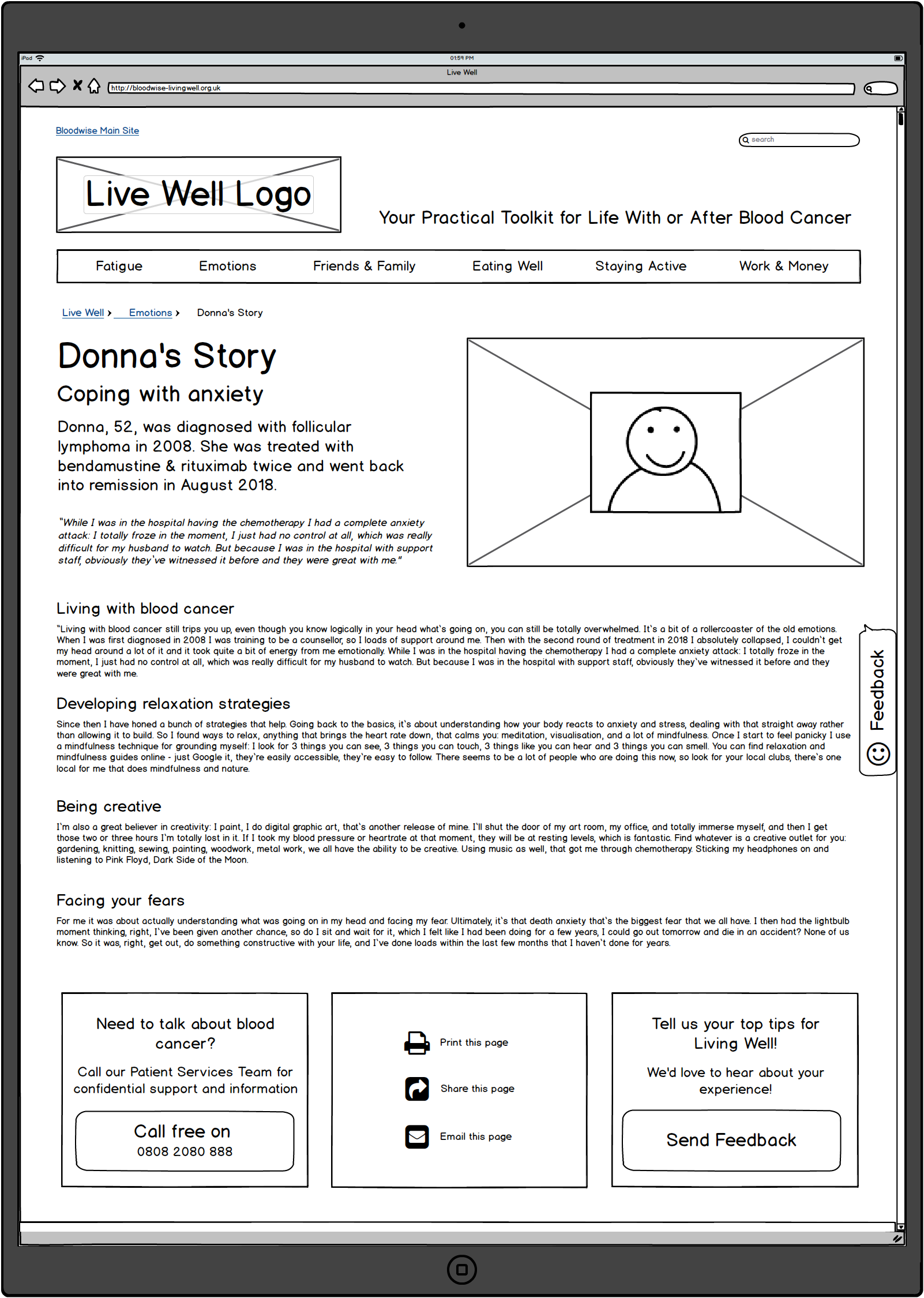
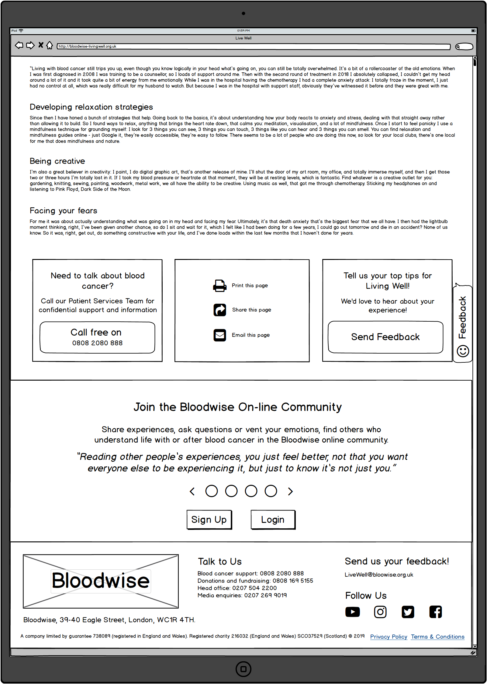
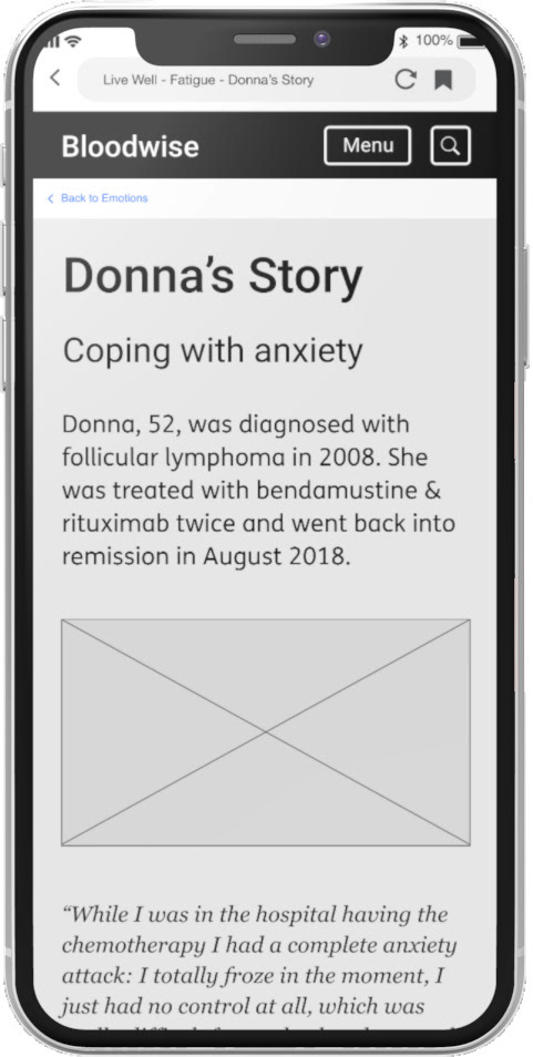
Left Image: Emotions > Donna's Story - 'Coping with Anxiety'
Right Image: Shows full page on scroll with calls to action & footer menu.
As seen above in the 'Fatigue > Corina's Story' wireframe spread, the 'Inspirational Stories' by and for people living with or after blood cancer, have a uniform template layout and structure to provide continuity and to aid recognition and recall for new and infrequent users of the site.
'WORK & MONEY' PAGE - Wireframe Version 1.0
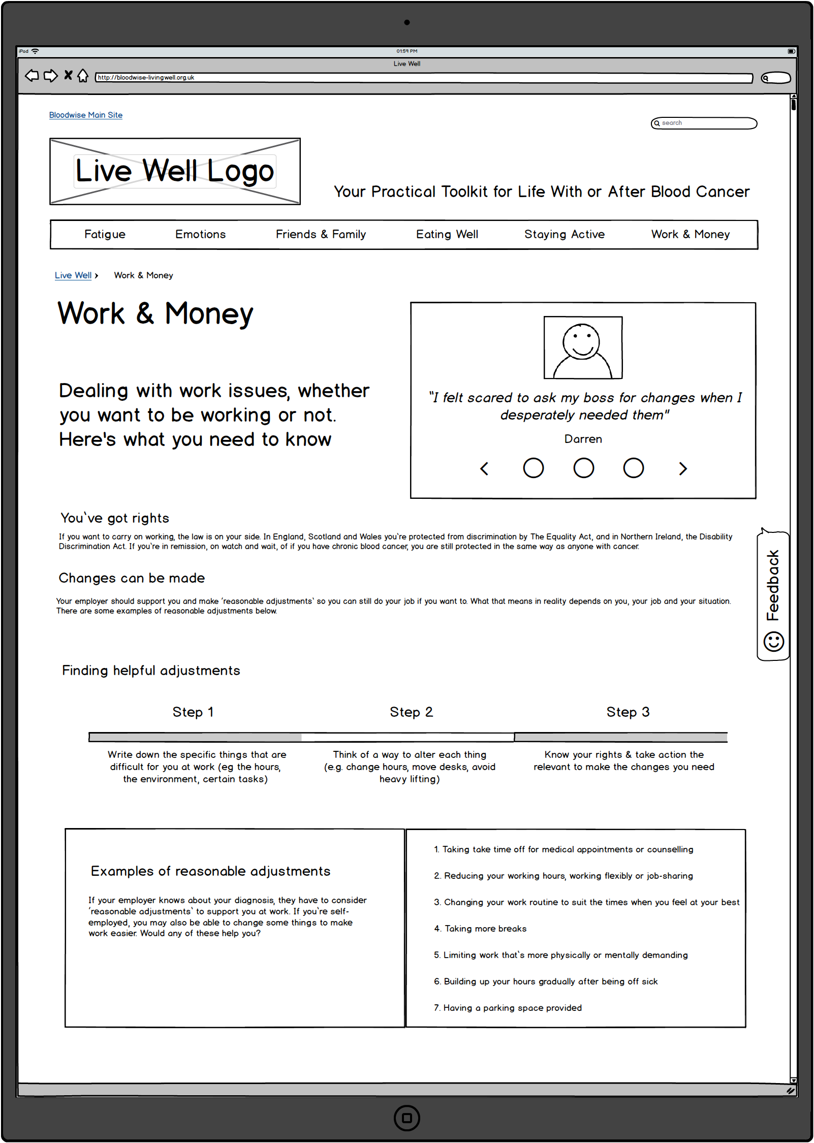
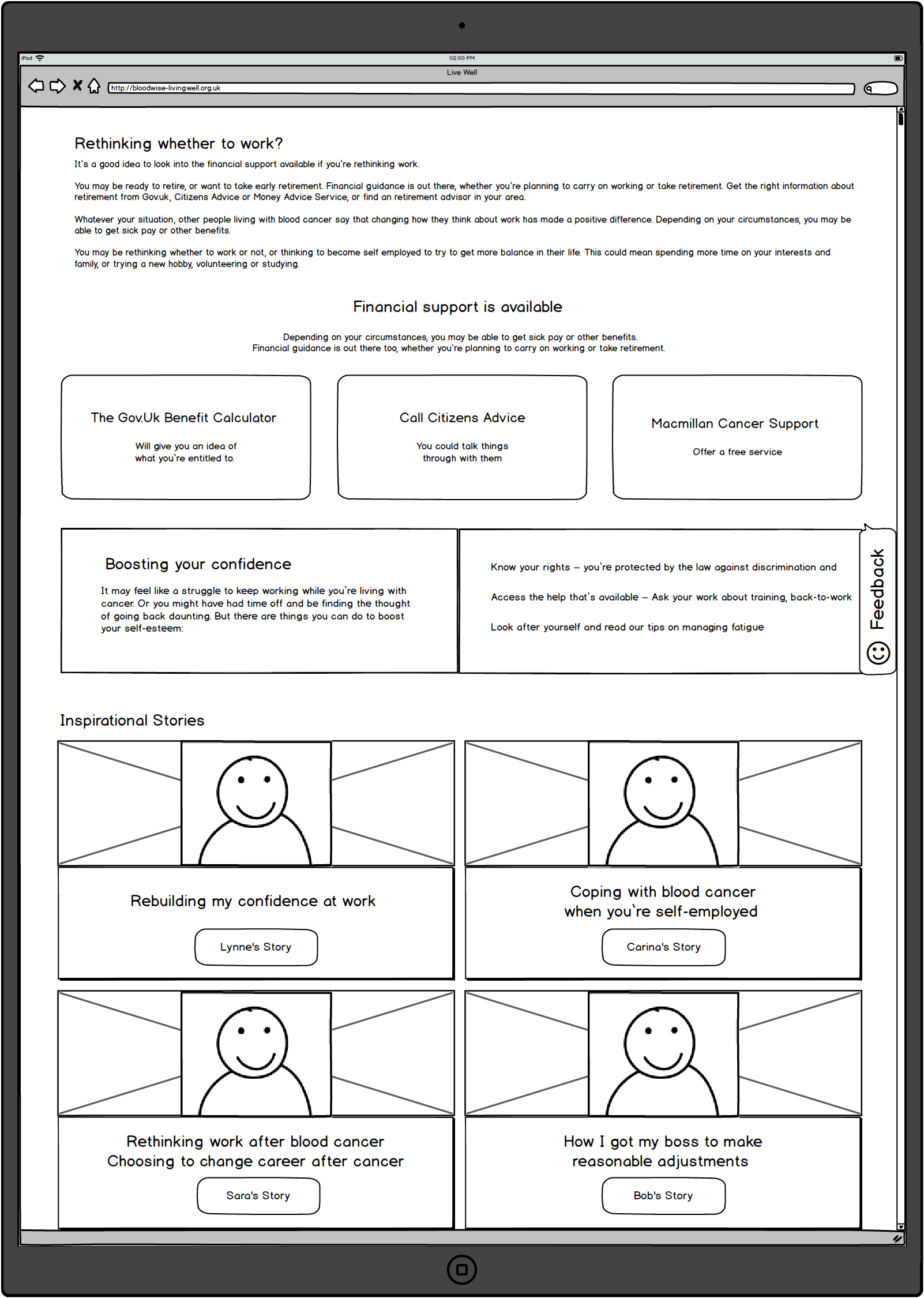
Left & Right Images: The 'Work & Money' section features complex information regarding employment rights and access to financial help and advisory bodies.
It is the page with the highest number of links to external service providers, organisations and charities. The challenge was to make these external links clear to users, as potential affordances, and to make it clear that they would open in a new page, therefore taking users out of the Live Well microsite.
There is a lot of procedural information which required a more visual approach rather than accordion menus nesting lists of text, in order to make the information easily accessible. The inspirational stories help to contextualise people lived experience of reorganising their personal circumstances and so do not feature above the first fold.
'WORK & MONEY' PAGE / MOCK UP - Wireframe Version 1.0
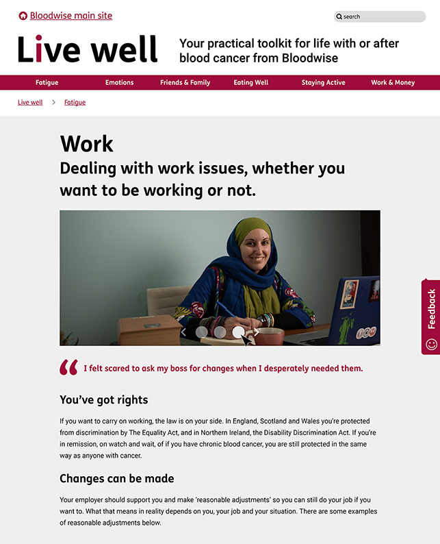
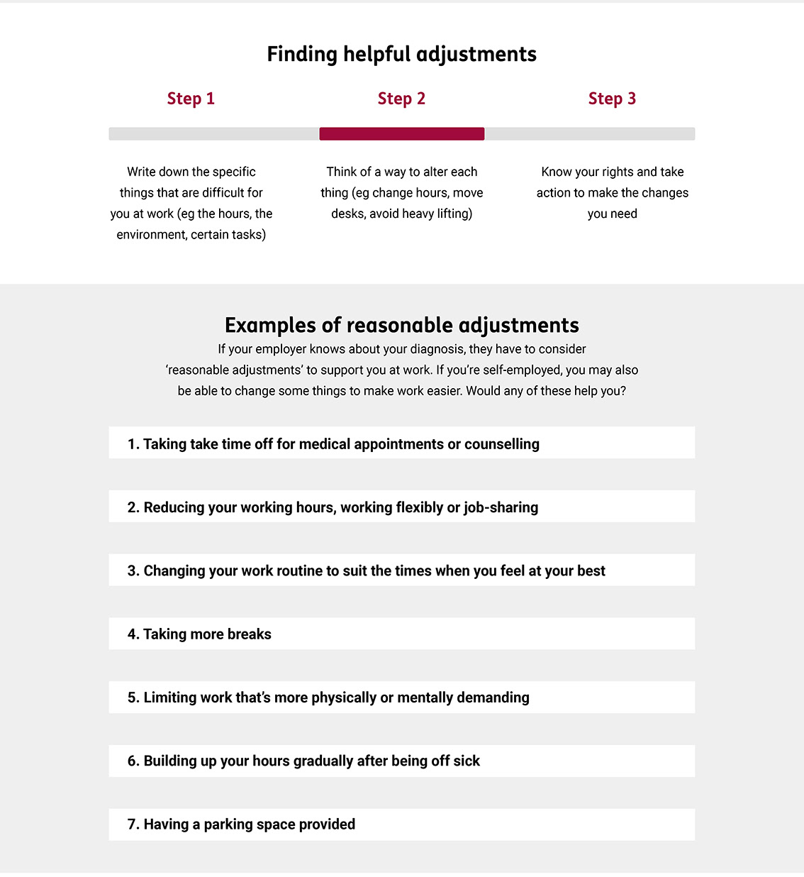
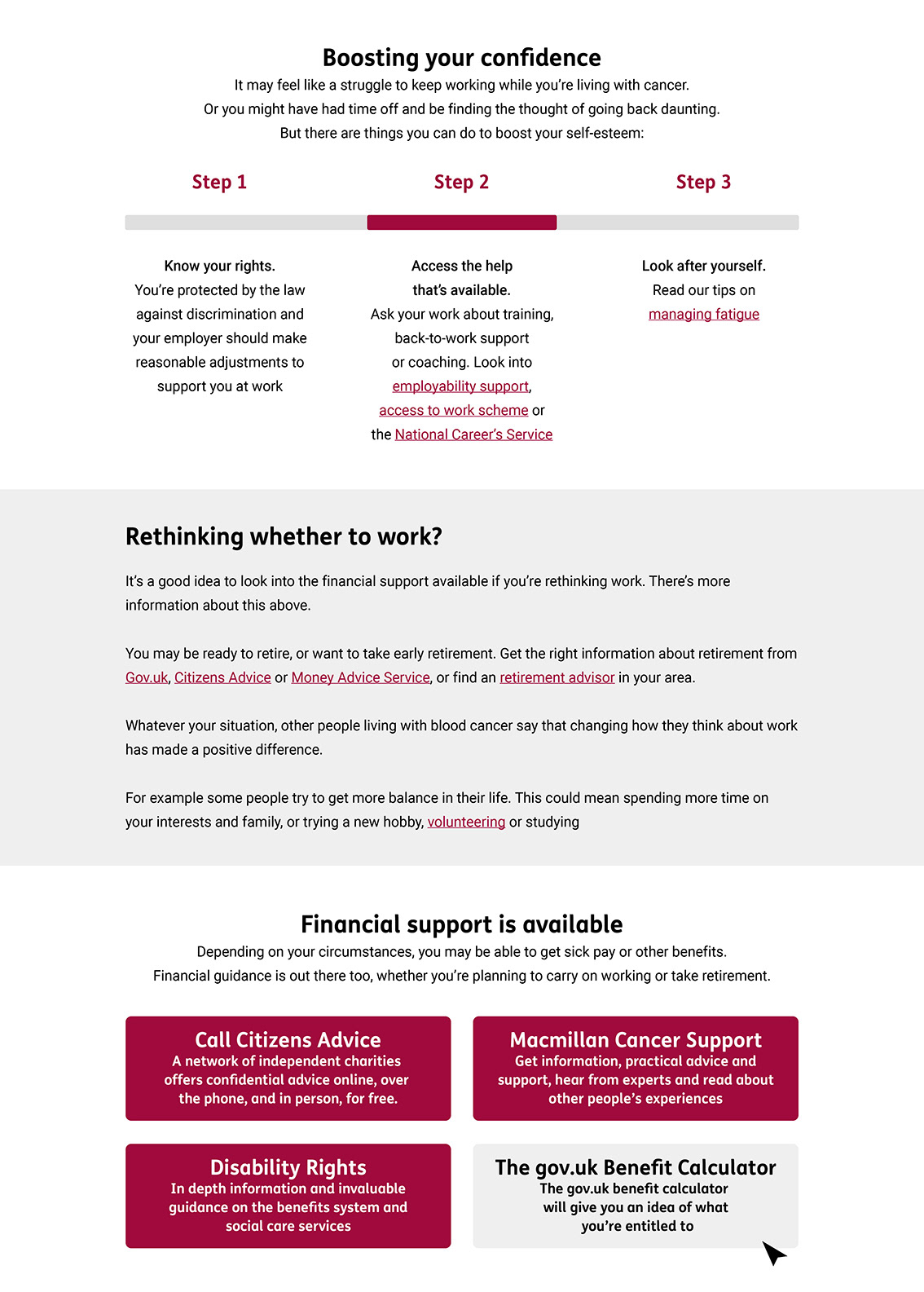
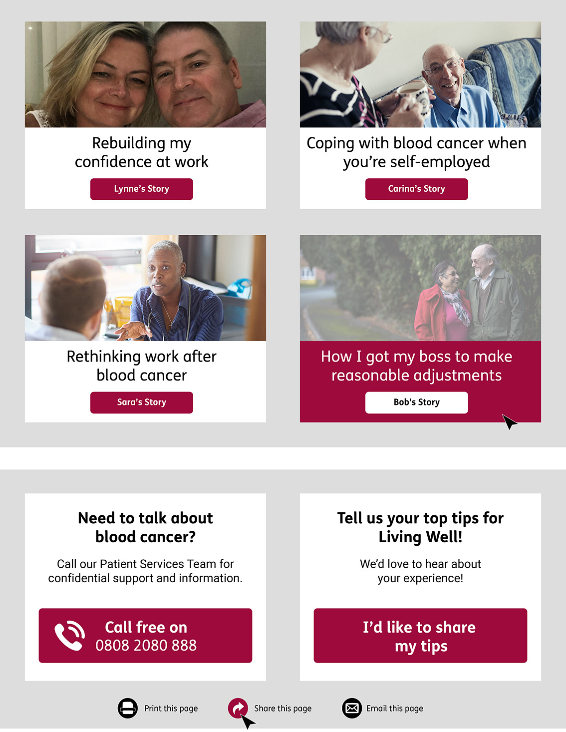
The images above are high fidelity mock ups based on the wireframes that experiment with the creation of colour schemes and visual assets for the Live Well microsite.
No special photography or illustration had been commissioned for the project so the layout, colour scheme and typography were therefore of even greater significance. The challenge was to create a site that promotes health and well being and is easy to read, whilst working with a fixed set of fonts and brand colours, of which a palette of bright and dark red's were the primary options available.
The site needed to uplift and inspire without appearing to alarm users or overwhelm them. It was a challenge to define the page hierarchy, navigation, headings and subheadings, as well as to make clear the variety and types of calls to action available, as well as the number of external links, using Roboto & FS Me fonts combined with a palette made up of reds, blacks, white and grey.
4. VISUAL DESIGN
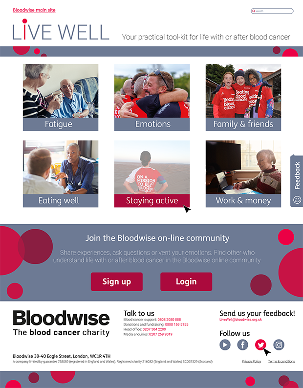
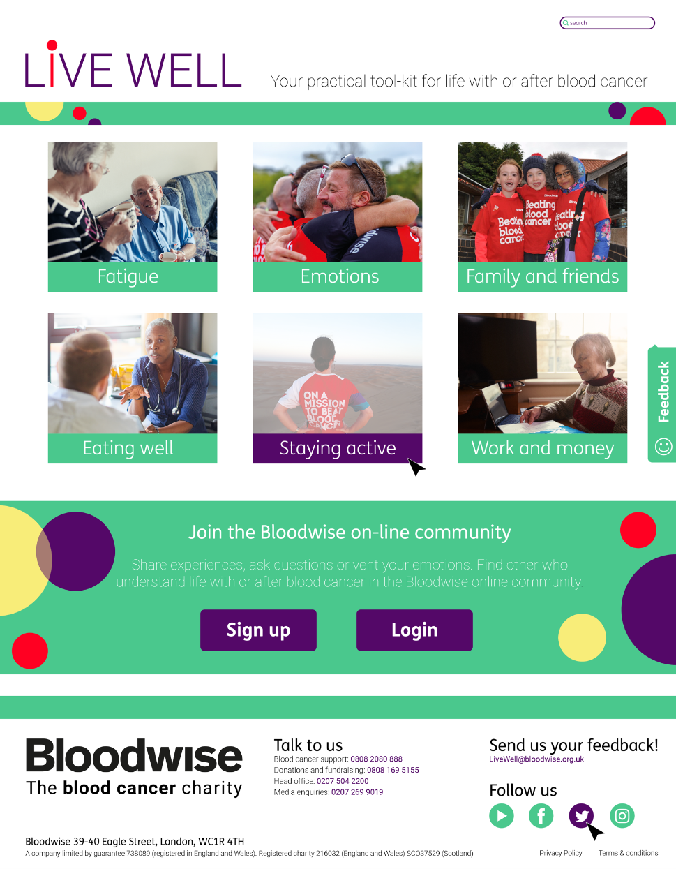
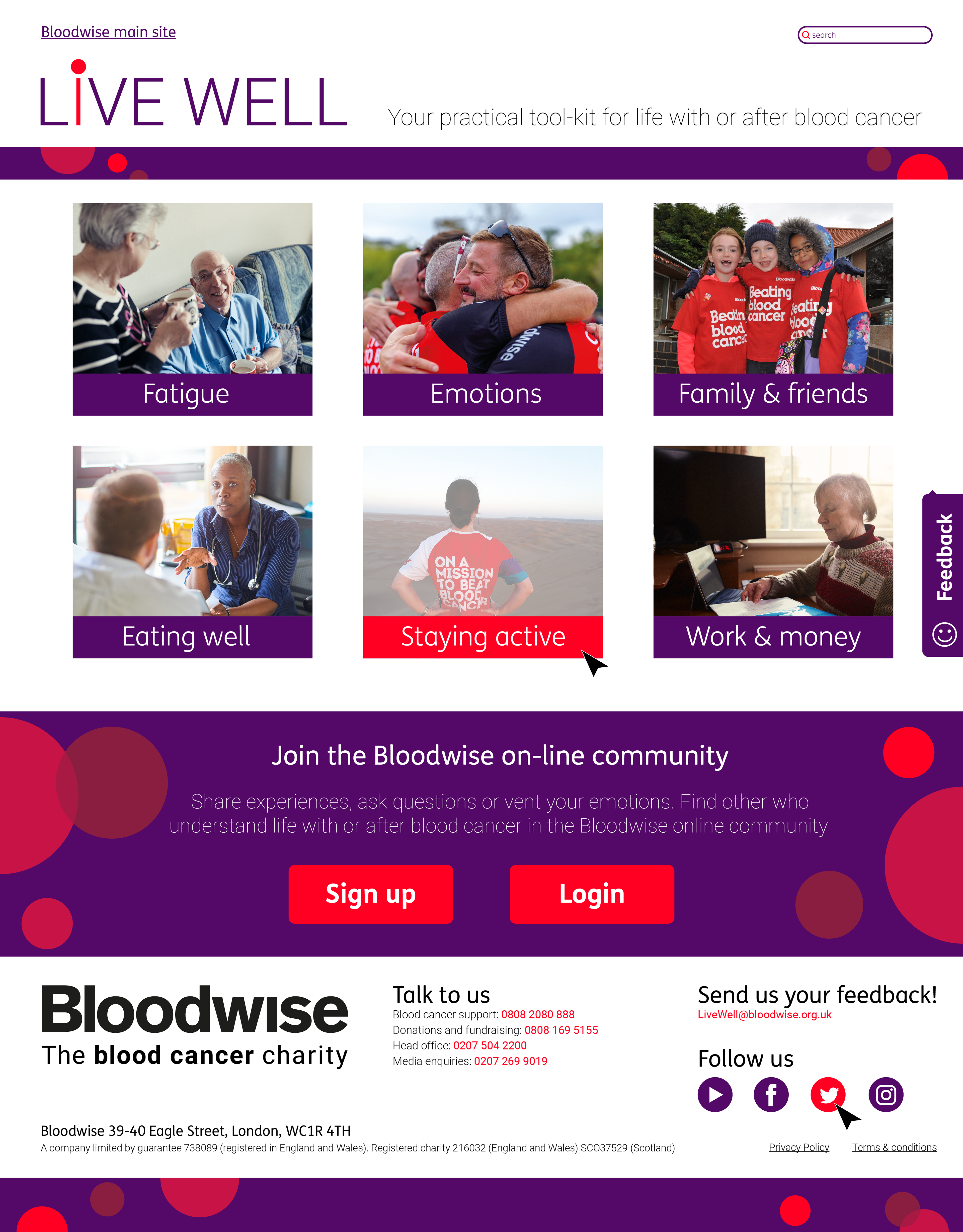
Before designing the style guide and page templates for the whole site, I worked with an in house graphic designer to generate layouts and colour schemes for the Live Well home page, based on the above home page wireframe, that we would later test with representative users.
As the site has a therapeutic aspect, it was important to explore how best to communicate these values whilst keeping all stakeholders on board with a shared vision. In doing so, a wide range of home page mock ups were generated that had to gain approval from the head of marketing before being shortlisted for use in the usability test.
PHASE 3
1. EVALUATION #2
I created and tested an interactive PDF, built in Balsamiq, and used Lookback.io, to record and analyse 5 out of 6 completed user test sessions, all moderated - 3 remote and 3 in person, before iterating the first set of wireframes based on feedback from the first round of usability testing.
STAGE 1
- Deciding what to test, creating scenarios and tasks
- Writing a test script & piloting the test to check the time and flow
STAGE 2
- Bloodwise recruited participants using the Bloodwise FB page
- Prepping the participants to make sure they have the correct browsers/ trouble shooting
STAGE 3
- User testing: 6 participants in-depth one hour moderated usability tests & 5 second home page test
- Findings & recommendations report / loopback.io recordings
2. METHODOLOGY
The Live Well Usability Test
Participants x 6
- 3 female (41 - 60 yrs. old) / 3 male (41 - 60 yrs. old)
- 6 x participants are previous Bloodwise site users / 0 x participants are current Live Well site users
- 2 are very experienced technology users and 4 are moderately experienced
- All are currently living with or receiving treatment for a type of blood cancer
Tasks
- 5 Second homepage Test
- Home Page Extended Review
- 1- 3 x user led discoverability tasks (time dependent)
- 1 x moderator led findability task (time dependent)
- Post Test Questionnaire
Rationale
- To test the copy, content and layouts in relation to user needs and goals
- To test the navigation, learnability, efficiency and satisfaction of the Live Well website.
- To test the width & breadth of content in relation to the value proposition of a “toolkit for living with or after blood cancer”
Data Collection Methods
- Lookback.io - Screen recordings of screen capture and participants
- Observations - Handwritten notes and quotes
- Excel Spreadsheet Matrix – Collection of diagnostic information, completed tasks, comments, quotes & scores
- SEQ Scores - For navigation tasks (ease of use)
- Net Promotor Scores – For each page visited
- Post Test Interview – Likes/ dislikes/ One significant change
*Please see below for a small selection of test results and analysis. It is not the full report!*
3. THE 5 SECOND TEST
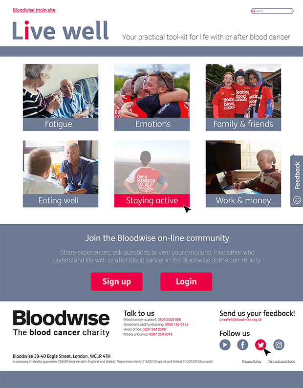
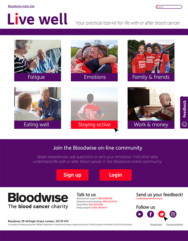
The final selection of approved home page mock ups, as seen below, were used to evaluate the tone, value proposition and messages being communicated by the Live Well micro site.
A '5 Second Test' was conducted with representative users in face to face and remote moderated usability tests to determine how effectively the Live Well micro site key communicated these messages, and to find out what products, services or activities are being offered, and to understand what users like or dislike about the site.

MESSAGE & BRAND
Findings The 5 second test showed that the purpose of the site and the brand message was not clear. “Information” was the only message that all of the participants unanimously mentioned.
Recommendations Add some explainer text beneath the main header ‘If you’ve been diagnosed with a blood cancer, no matter what type, you’re in the right place. Here you can learn from and connect with people like you’ in order to emphasize that this is a site offering peer to peer support.
FONT WEIGHT & SIZE
Findings Participants did not notice or comment on the strap line next to the Live Well logo. When pointed out after, all 5 participants commented that it lacked contrast and was difficult to read.
Recommendations For the strap line, increase the font weight and size, consider using black instead of a colour.
COLOUR
Findings There is no clear overall winner in terms of the 3 x homepages that were tested. The grey version was associated with negative emotions and fatigue “doom & gloom”
Recommendations Strip the homepage back to black and white and grey in order to build it back up. Add in one pop colour – the crimson red and one other accent colour (purple or blue / grey). Eliminate the Home Page 1 design as the grey colour produced markedly negative reactions in both participants.
NAVIGATION
Findings All participants stated that the 6 x navigation category labels and images were clear and relevant to them. All participants stated that they thought the 6 x images and accompanying labels would enable them to access the website content/ pages. All participants stated that the navigation system appeared to be simple to navigate.
CALLS TO ACTION
Findings
The main features and promotions on the home page were not uniformly recognised. The community sign up banner confused participants, as it was not clear to them if the Live Well site required a login and password. The size and colour of the Sign up/ login buttons confused x 3/5 participants who thought they were required to login and create an account in order to use the site. The value exchange on the community sign up banner was not clear. Users were not clear what features and benefits they would gain from joining.
Recommendations
Consider the main user goals for using this site. For example, all of the participants positively commented on the novelty of a specialist help line. Conversely, the BW forum did not surprise or delight participants in the same way, so we recommend adding the helpline number to the homepage and putting the emphasis on this feature instead.
Change the colour balance and distribution of colours on the homepage in order to guide users to the most important parts of the page. For example, use the colour red sparingly to flag up the most valuable or relevant next ser interaction. Shrink the size of the Sign up/ login buttons on the community sign up banner. Change the heading for the community sign up banner to something more suggestive of peer to peer support.
Consider creating a closed BW Facebook group instead of taking users away from the Live Well platform and trying to onboard users to the existing external BW forum which is disorientating and confusing.
FOOTER
Findings The Bloodwise logo in the footer (black on white) overpowered the live well logo and branding. When asked what the main ‘main features and promotions’ are on the site, the ‘Talk to us’ section in the footer menu was referenced more than any other page content.
Recommendations Change the colour balance and distribution of black and white on the homepage so that it does not compete with other parts of the page. For example, lessen the contrast of the white and black footer.
4. TASKS
Discoverability & Findability Task Findings
SEQ SCORES - For navigation tasks (ease of use)
TOP LEVEL SUMMARY
General
The value proposition is not clear.
The content value is context specific and highly individual, based on whether users are living with or after blood cancer, as well as the specific type of blood cancer they have.
The ‘Inspirational Stories’ received the most positive feedback.
Facebook is a key rival in terms if offering Peer to Peer Support.
All Pages
The navigation is user friendly.
The sections, labels and pics are clear and descriptive.
Increase the text size for the body copy from 16pts (as seen in the wireframes) to 18pts.
PHASE 4
ITERATION
Based on the usability tests, the interactive PDF wireframe was revised and updated. It was then then critiqued internally by the Bloodwise digital product manager and the interim head of digital using the gov.uk website guidelines for best practice, before then going through a third and final round of iteration.
ITERATION #1 - Based on user feedback re: the usability tests
- Home page iteration - choice of colour scheme & simplification of the footer.
ITERATION #2 - Based on gov.uk principles and guidelines
- Group design review including the Bloodwise senior product manager and interim head of digital
ITERATION #3 - Designing a set of responsive page templates for desktop, tablet & mobile
- Please see phase 5
HOME PAGE - Wireframe Final Version
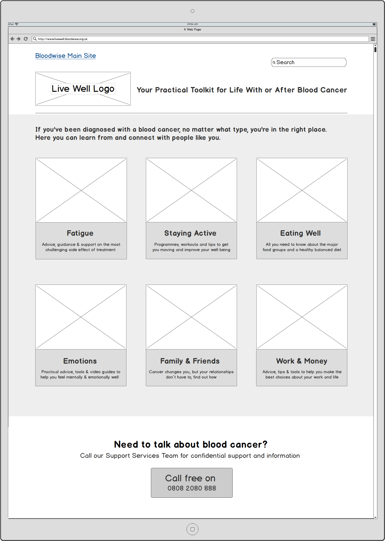
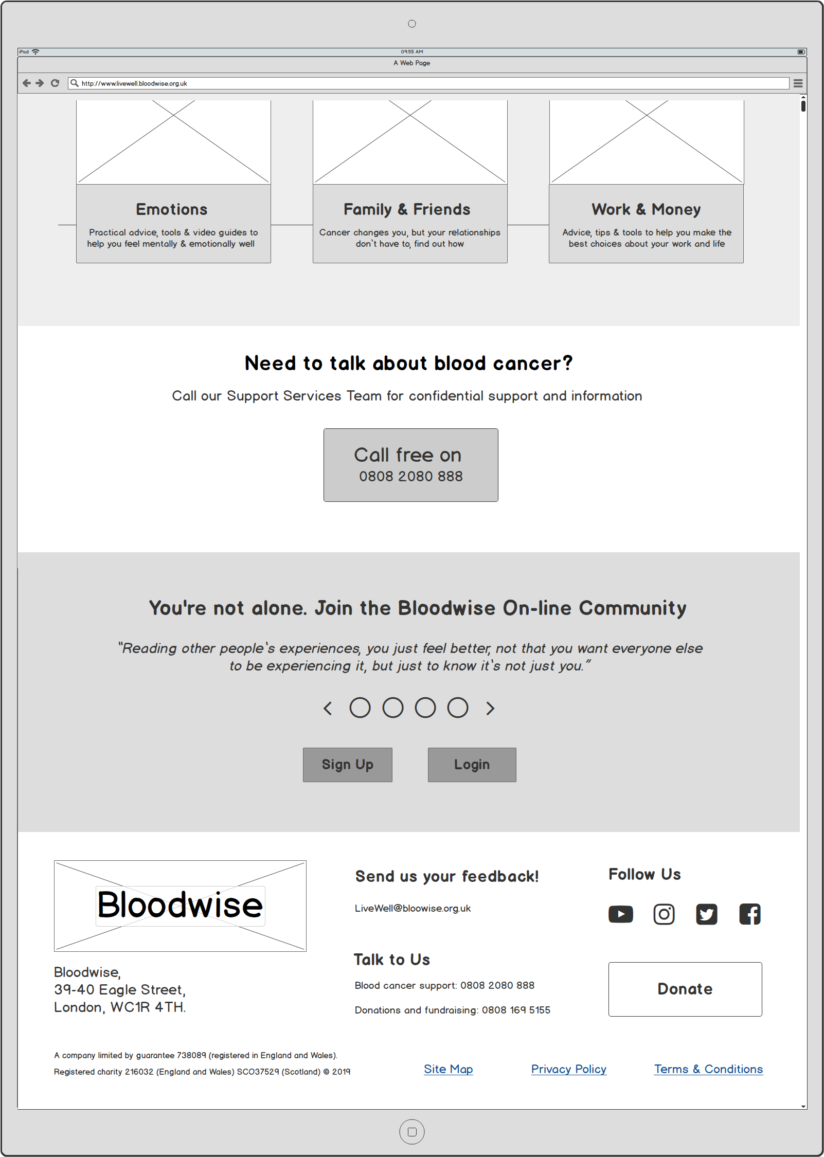
The main changes here include:
Image 1 - Fatigue was the most desirable category to click first. It was chosen by 3/5 participants so it is positioned first in both the navigation menu bar and the homepage categories.
Subheadings were added to each of the main navigation labels to explain the type of content users can expect before clicking the image or text boxes.
Image 2 - Feedback from the usability tests showed that the telephone helpline widget titled, 'Need to talk about blood cancer' was the most valued service and interaction afforded to users of the site. Knowing that there are people to speak to was incredibly reassuring. Most users were not aware this was a service provided by the charity.
This took precedence over the Bloodwise community which came second on the order of user priorities and goals. It was deemed to be both a desirable and necessary portal to interact with people according to the specific type of blood cancer users were either living with or after.
'FATIGUE' PAGE - Wireframe Final Version
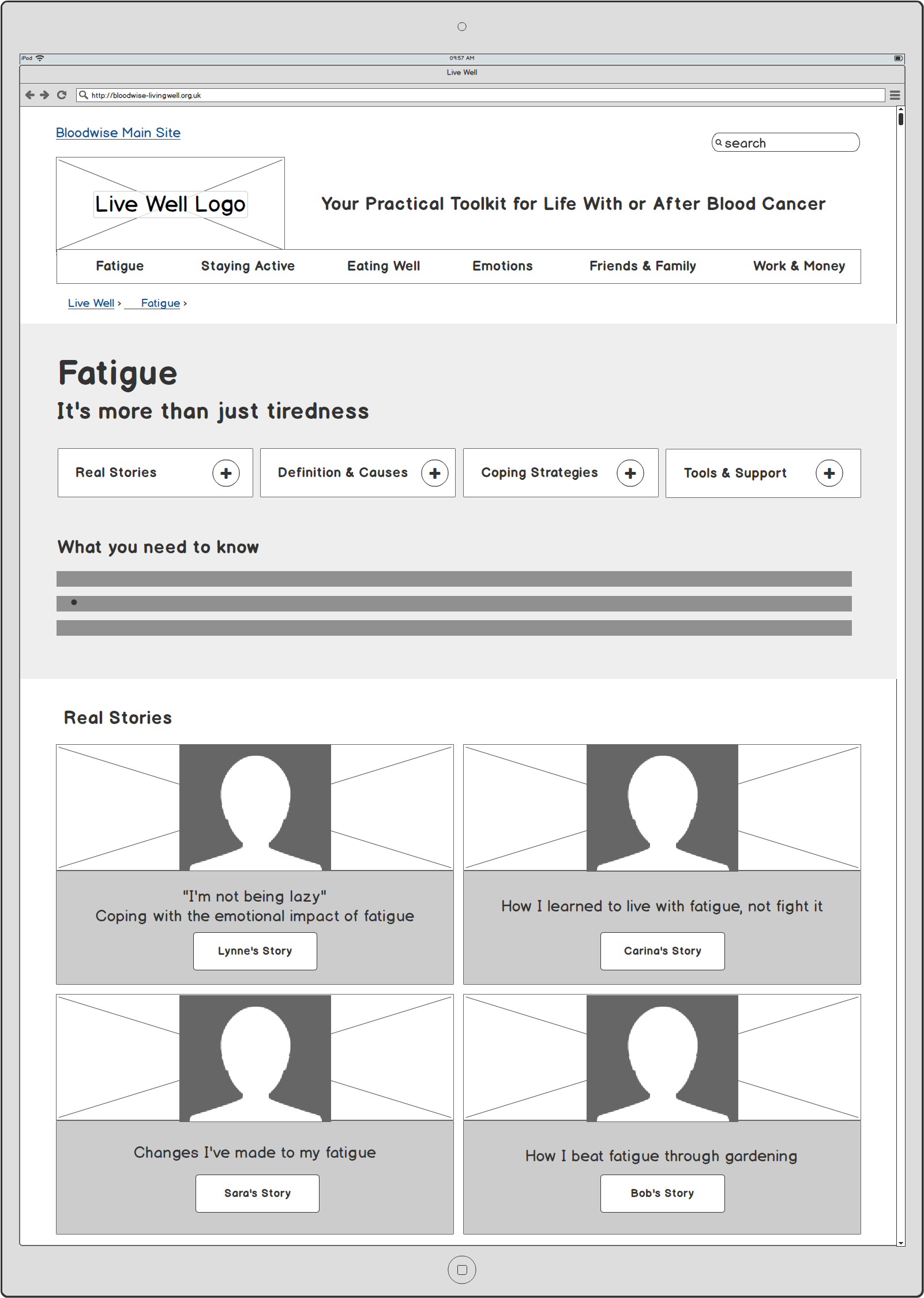
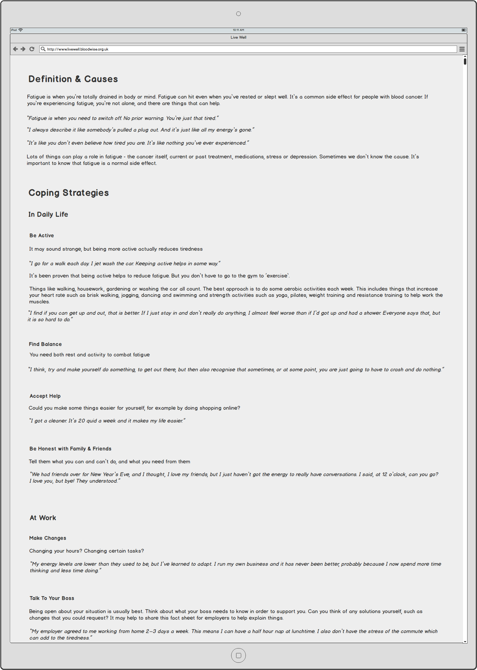
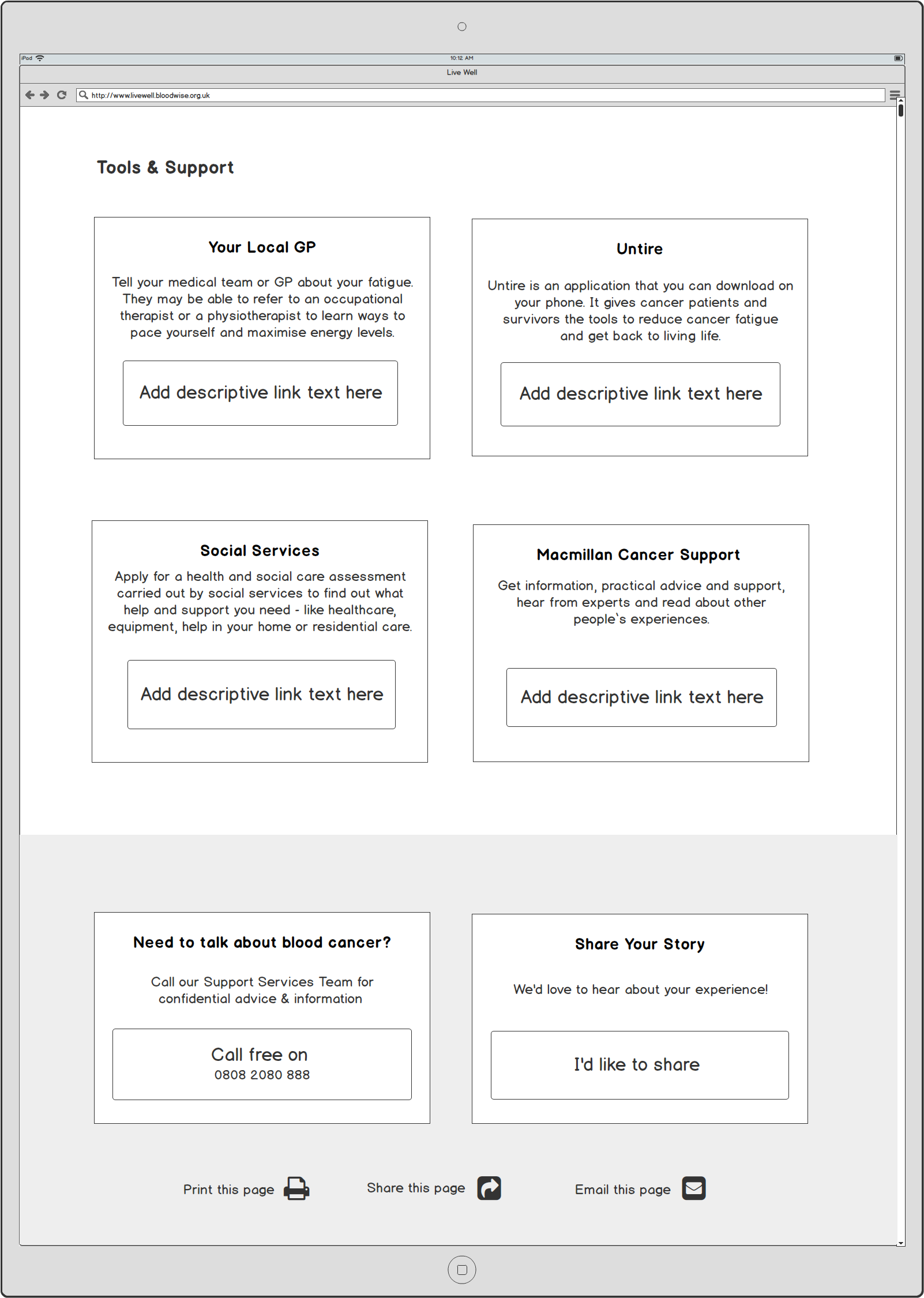
The main changes here include:
Image 1 - Inclusion of jump menu links.
Image 2 - Change to long form text. The accordion menus were not user friendly for users with impairments.
Image 3 - Increased size and weight of text inside boxes with additional signposting for all links to external service providers and organisations.
'FATIGUE' > 'REAL STORIES' #1 - Wireframe Final Version
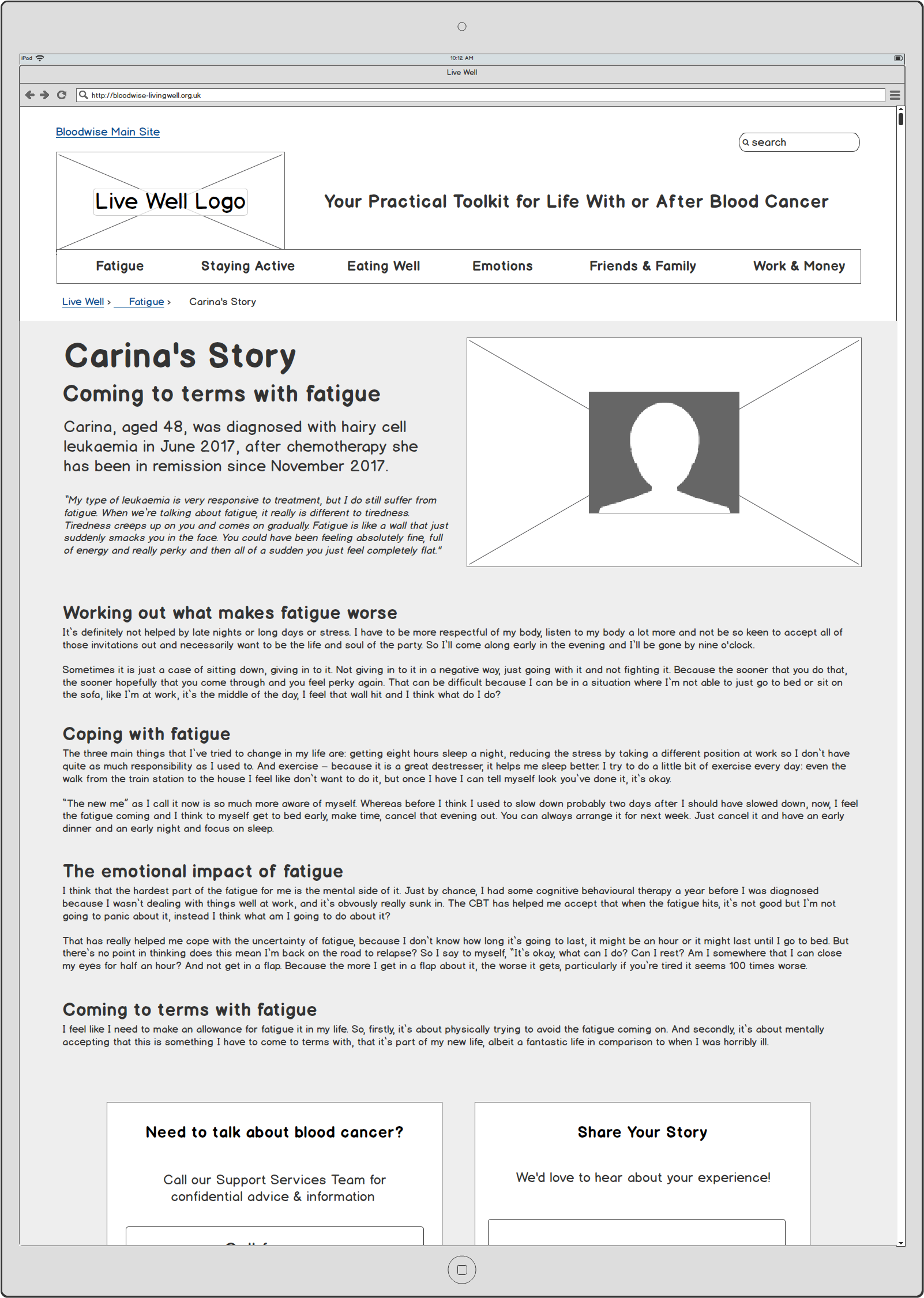
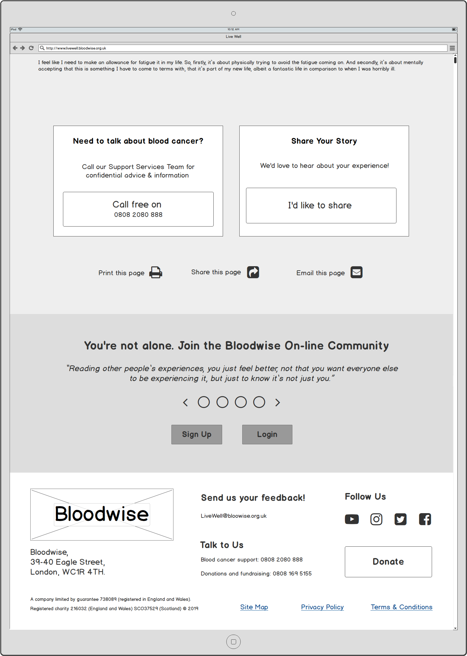
The main changes here include:
Image 1 - No change
Image 2 - Increased size and weight of text inside call to action boxes with additional signposting for all links to external service providers and organisations.
'WORK & MONEY' PAGE - Wireframe Final Version

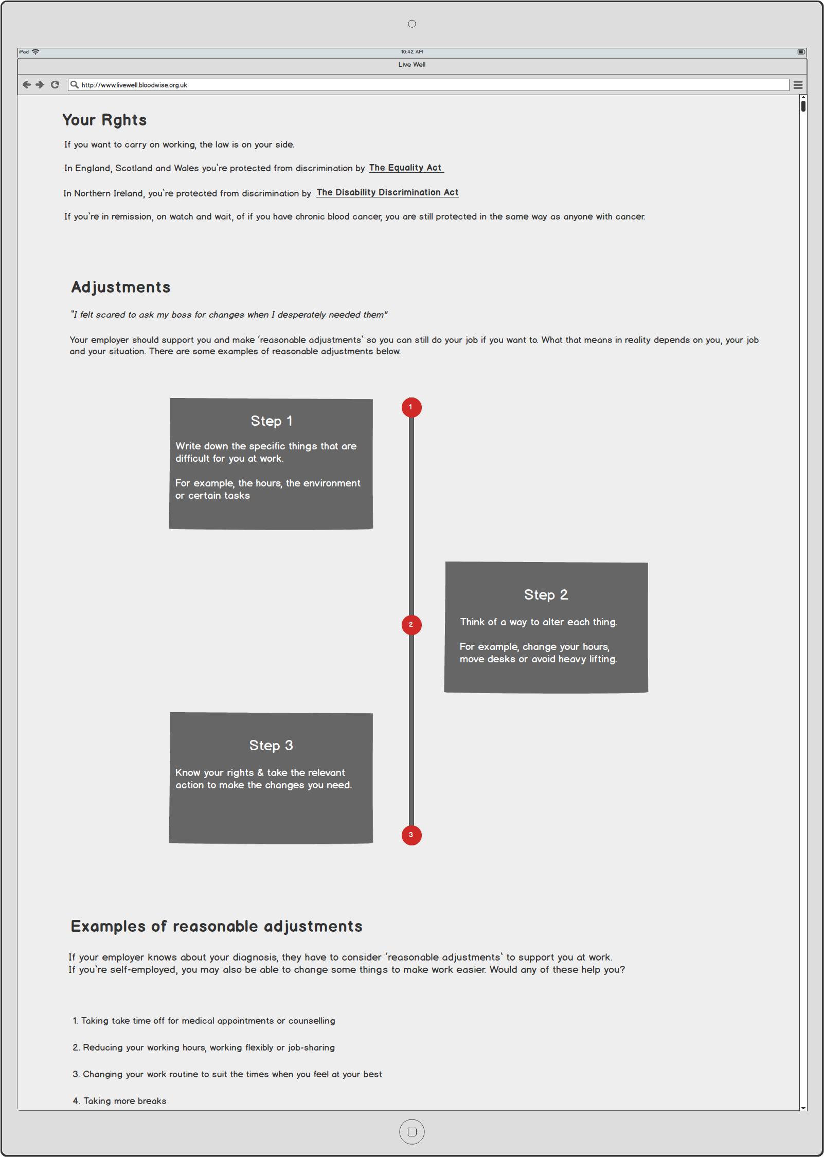
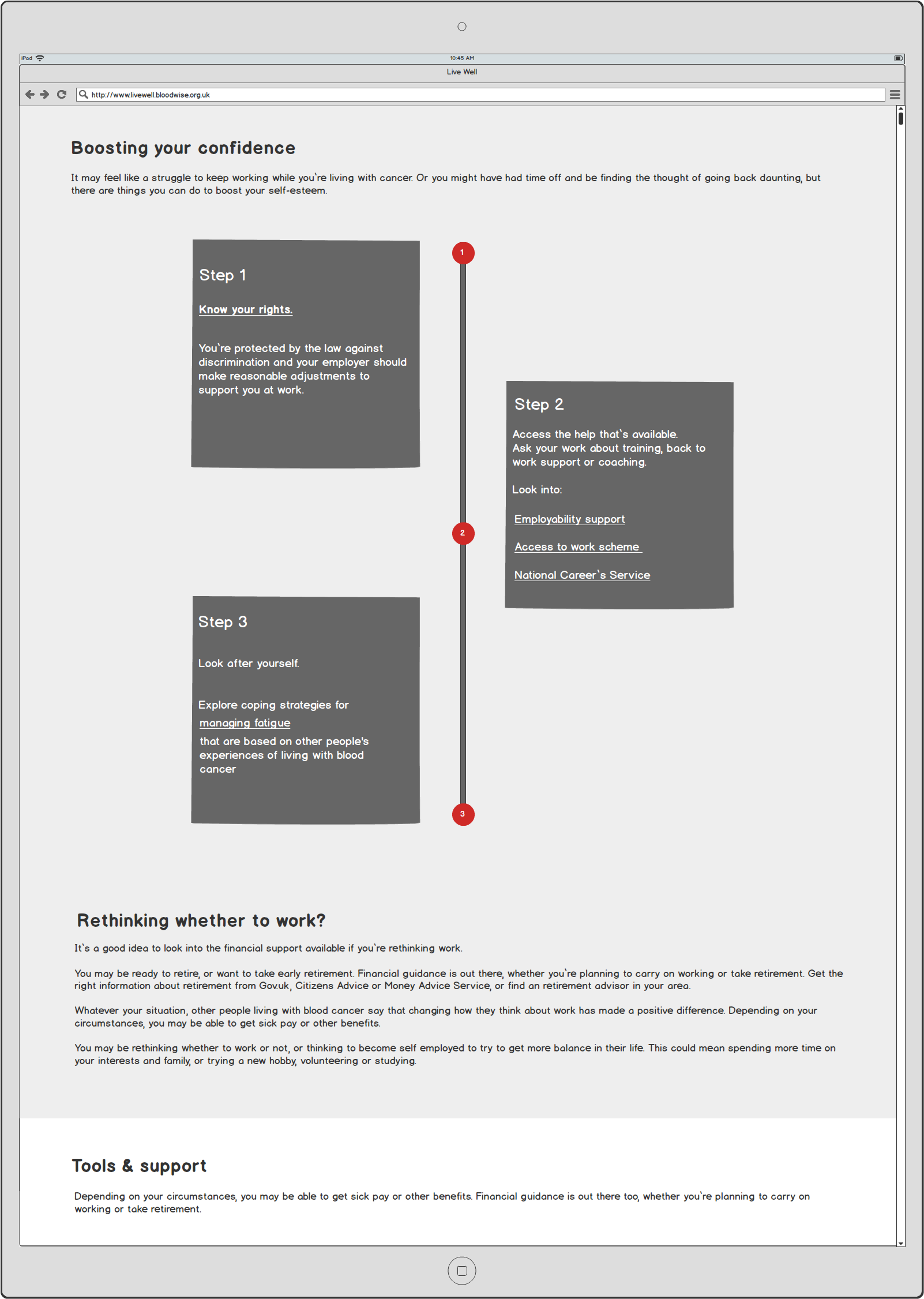
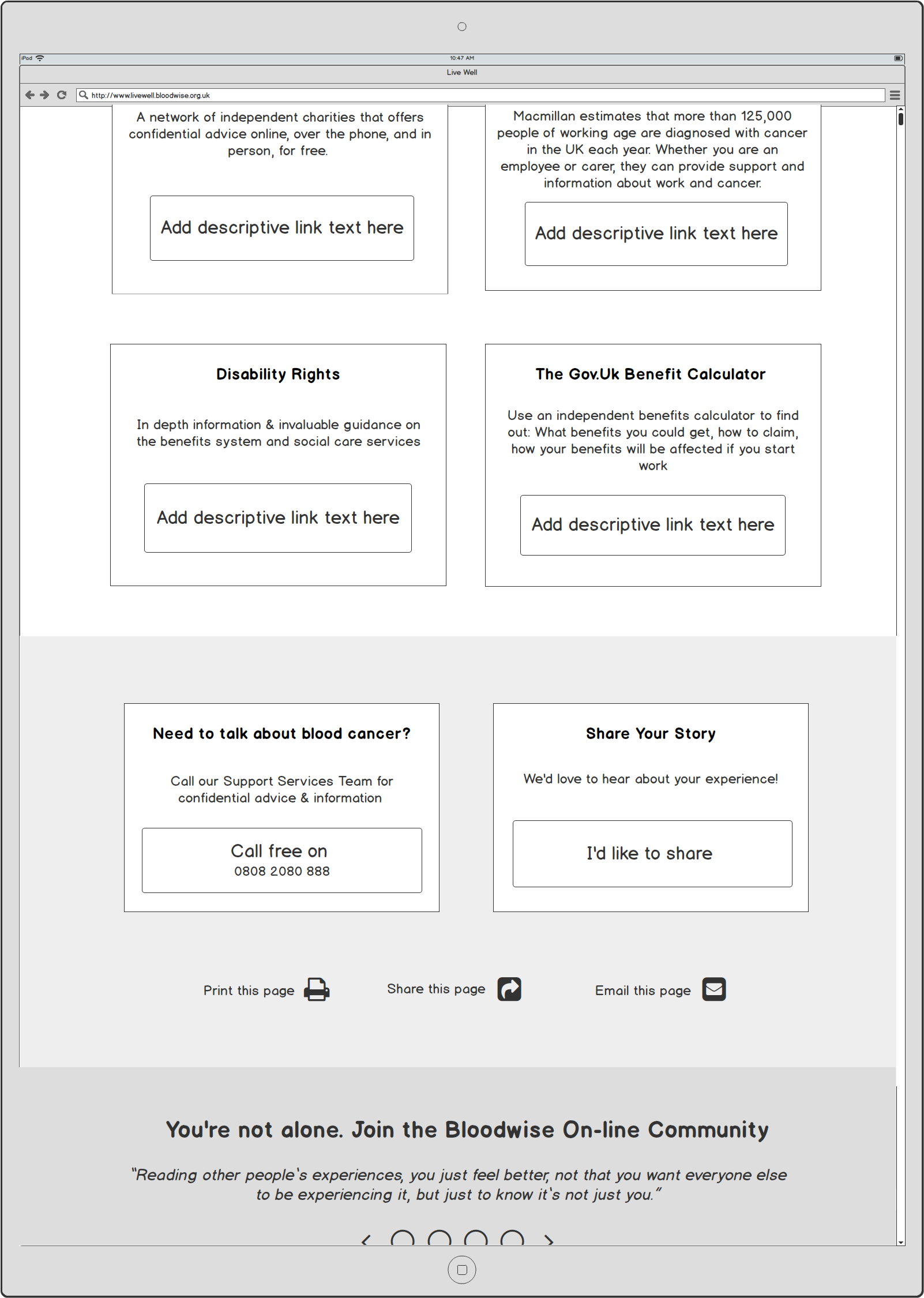
The main changes here include:
Image 1 - Inclusion of jump menu links.
Image 2 - Change to long form text. The accordion menus were not user friendly for users with impairments. Redesign of boxed information and inclusion of timelines and linear vertical step by steps.
Chunked content and information timelines provided clear user pathways and make potential interactions more explicit to users. For example, the links to external service providers.
Make sure all external links take users directly to the relevant page, “There’s no point to come off the site and then have to search to find that information gain”(P4)
PHASE 5
1. UI DESIGN
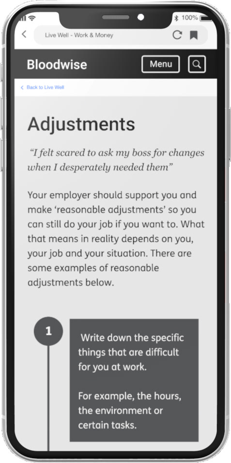
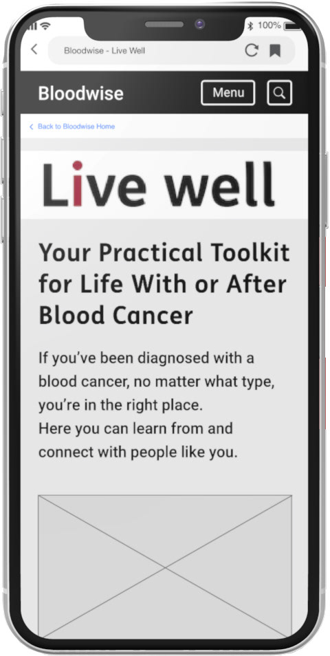
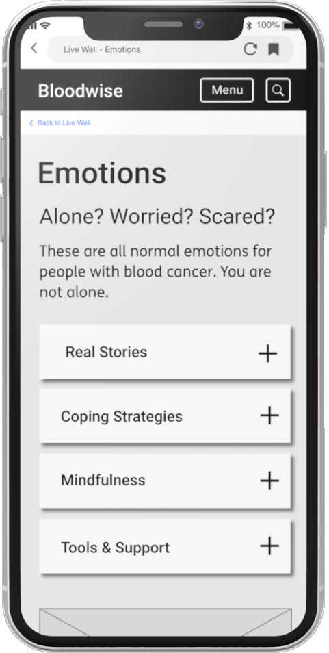
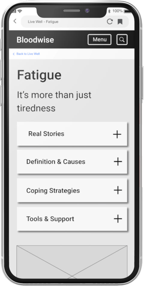
'Live Well' live website home page "skin" for desktop and mobile
2. MOBILE DESIGN
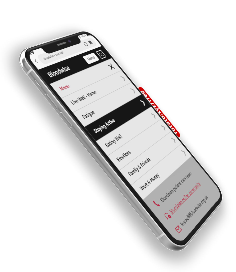
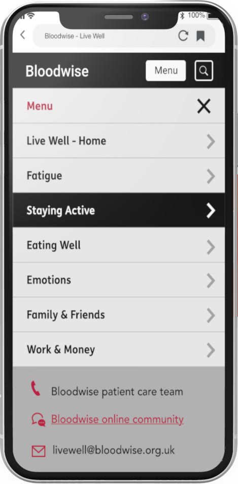
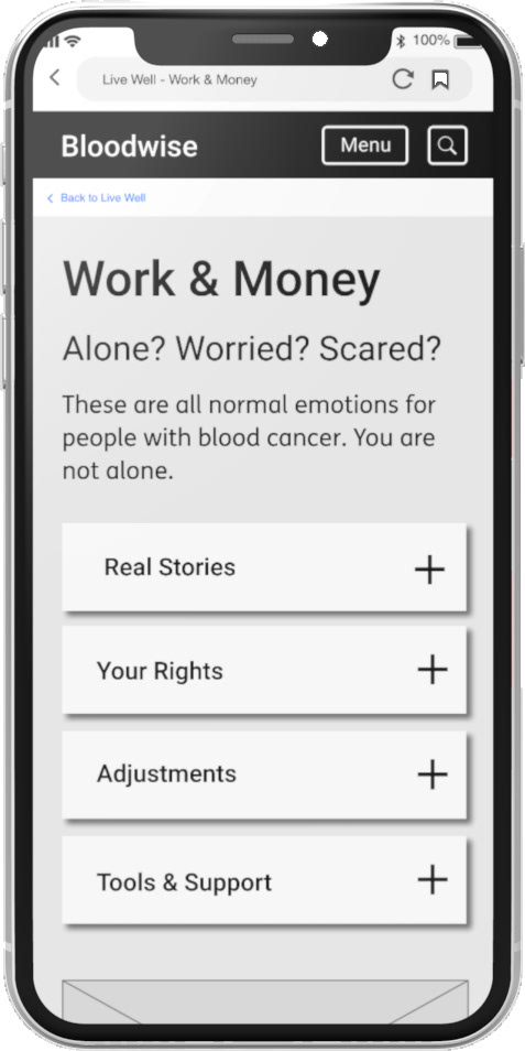
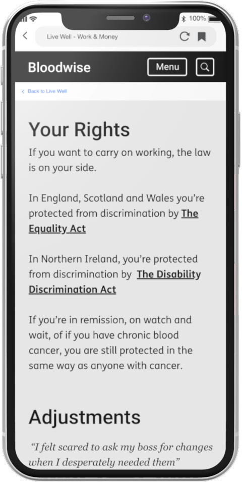
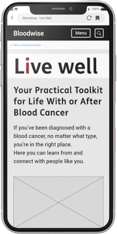
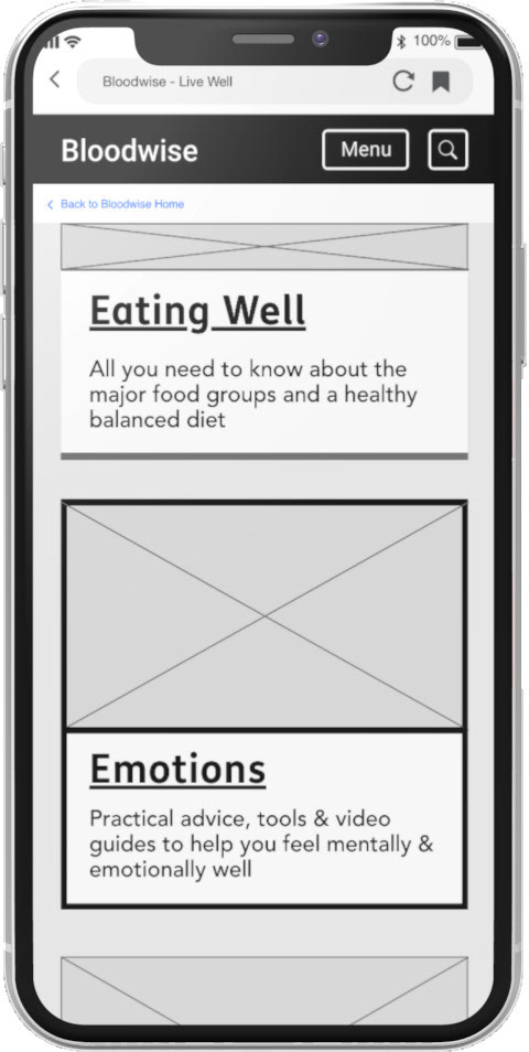
Once the wireframes were completed, I was asked to create a further set of wireframes to translate the Live Well site for mobile which I chose to do in Adobe XD. Once both were completed the site was passed onto a freelance developer to build. This involved the creation of a style guide, page templates & UI library.
