Cancer Research UK - Home Page - Evaluated Spring 2018
Client
Cancer Research UK (CRUK) is a major UK charity. Their site provides information about cancer, support services, research, fundraising activities and raises donations. It is targeted towards a broad demographic including people coping with cancer, their family and carers, researchers, volunteers and other interested individuals.
Brief
Cancer Research UK consulted City, University of London for the evaluation of their site. Cancer Research UK provided two main areas of their website that they wished to find out about:
1. The Home Page
a) What do people think of the homepage?
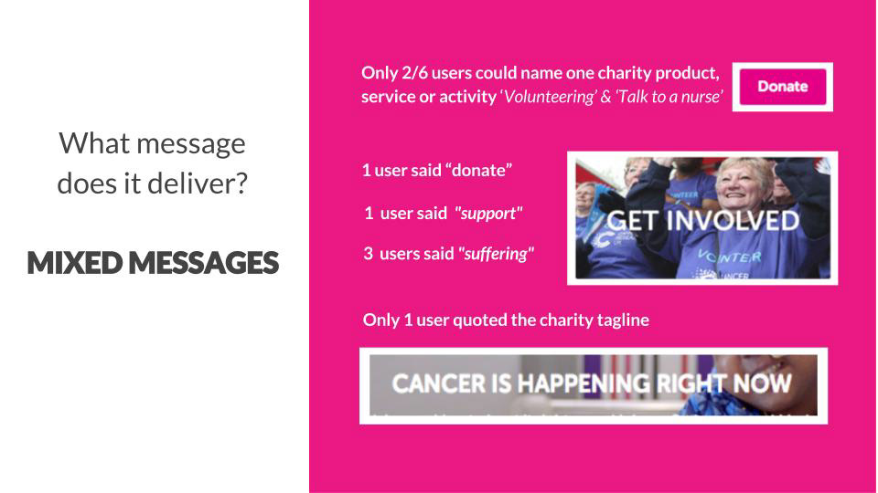
b) What message is it delivering?
c) What’s going well here and what could be improved?
2. The Fundraising & Shop Sections
Assess the usability of the fundraising events and shopping sections.
Process
This is an abbreviated version of my 2018 coursework for Master's level 'Evaluating Interactive Systems' coursework.
1. Competitor Review (general, home, events & shop)
2. Cognitive Walkthrough (events)
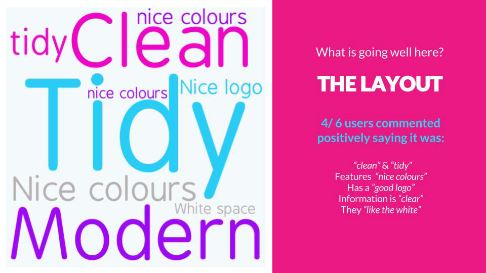
3. 5 Second Test - 8 Participants (home page)
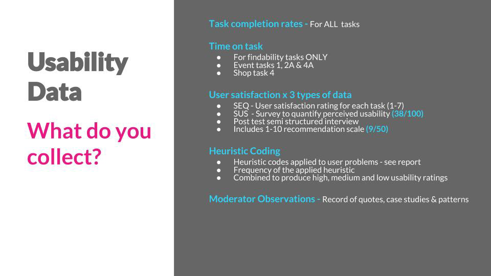
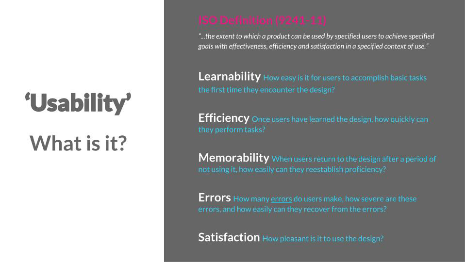
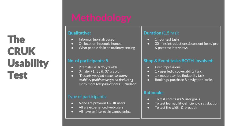
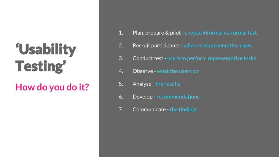
4. Informal User Testing - 5 Participants (events & shop)
Outputs
1. Detailed report of methodology
2. Matrix of usability problems
3. Presentation (with video) of high priority ket insights
1. Competitor Review
Competitors
Great Ormond Street Hospital (GOSH).
Macmillan Cancer Support (MM)
British Heart Foundation (BHF)
Sue Ryder (SR)
Mind (M)
Why choose these?
Like Cancer Research UK (CRUK) each competitor is a public facing UK based health charity. Similarly, each one seeks to provide an omni-channel user experience that combines multiple contact points with members of the public, such as advocacy and research, support and guidance, fundraising and retail. Like CRUK, each charity has a separate e-commerce site and all five charities promote fundraising activities and events of a similar nature, including partnering with external organisers.
Findings
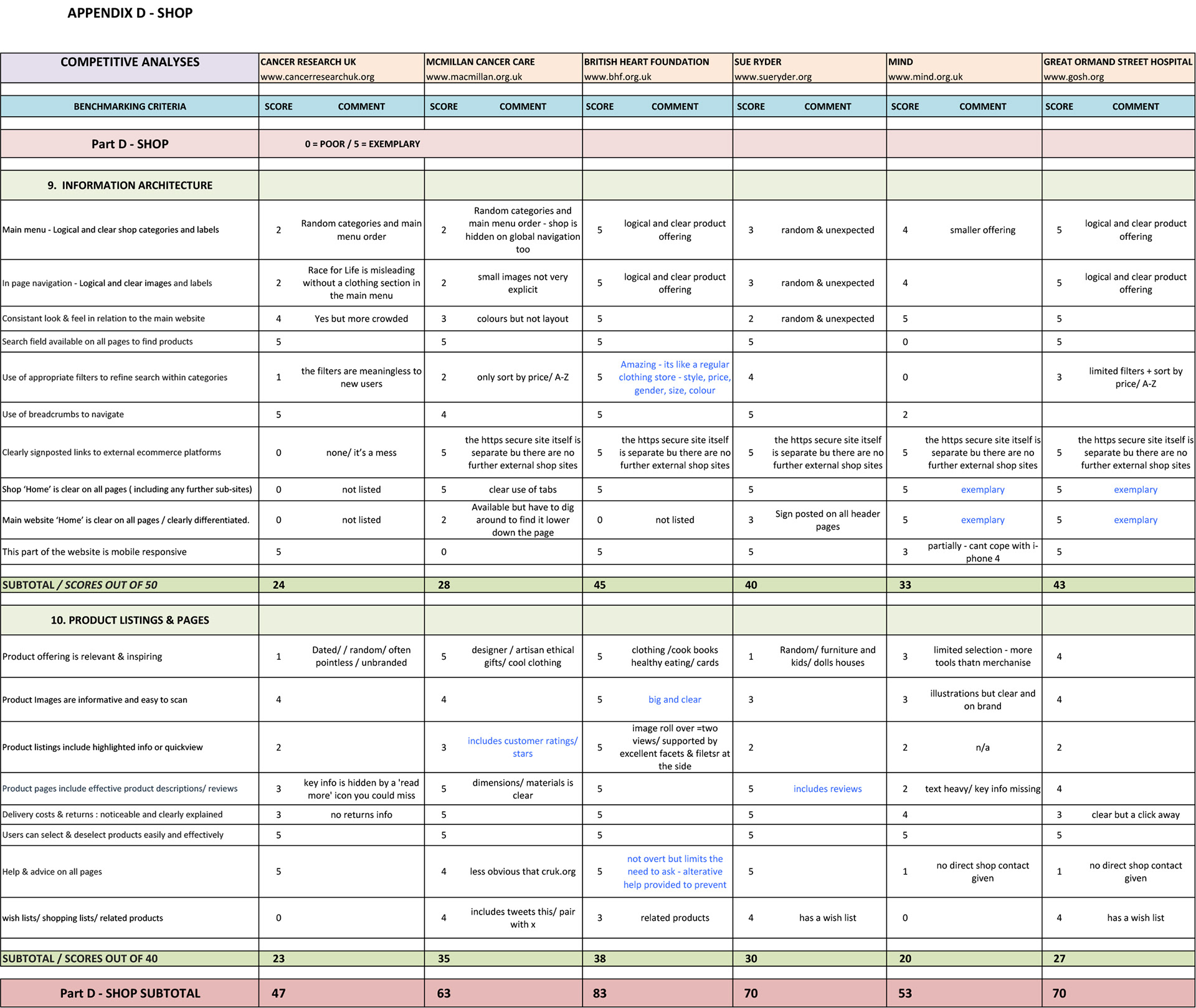
Scores are both quantitative & qualitative, below are some examples of the score results collected.

2. Cognitive Walkthrough
‘The cognitive walkthrough is a usability evaluation method in which one or more evaluators work through a series of tasks and ask a set of questions from the perspective of the user. The focus of the cognitive walkthrough is on understanding the system's learnability for new or infrequent users.’
The Usability Book of Knowledge (www.usabilitybook.org)
Task Scenario
Register for a cycling fundraising event for two people starting in London that will take place between June and August 2017.
User(s)
A young married couple who work in the city, both are in their early 30’s. One is a keen cyclist; the other has no experience of cycling long distance. They are looking for a challenge that is no more than 100 miles long and are expecting to raise approximately £500.00 each. One has taken part in a charity fundraising event with a different charity some years ago, but the other has not. Both are comfortable with technology and purchase goods and services regularly online.
Goals & Motivations
To both raise money and spend some quality time in the countryside together whist getting fit and experiencing long distance cycling. Cancer Research UK is their chosen charity due to relatives on both sides of the family having been affected at some stage.
Each of the 4 questions in the grey text boxes on top row are applied to each conceivable action required to achieve the desired goal.
Findings
As an inspection method it threw up a lot of questions that informed my hypothesis that not enough guidance, help or documentation is provided in the events pages that advertise events organized by external partners on the CRUK website. For example, steps 11 A – F show that users have no clear pathways in order to assess what options are available when they do not wish to commit to a minimum fundraising amount.
In the task scenario, the young married couple expect to raise approximately £500.00 each but order to qualify for a charity place on the London to Brighton Bike ride, CRUK requires them to raise £700.00, if they are to qualify for a cheaper registration fee.
Having conducted a review of the link to the external website, it is clear that alternative options are available to take part without committing to a minimum fundraising amount, but to instead pay a higher registration fee and to fundraise independently. These options are not made clear on the CRUK event page listing, instead users are faced with a dilemma to either revise their goals in favour of the fundraising target, or to search for another event.
According to Fogg's Behaviour Model (2009), users now lack motivation, ability and triggers to continue to reach their goal. This can result in users abandoning the task or leaving to research opportunities on competitor sites.
3. 5 Second Test
Findings

4. Informal Usability Testing
The Events Section
USABILITY PROBLEMS: 31
Data Collection
Participants agreed for their screens and for themselves to be filmed whilst conducting the tasks, using Silverbaack recording & editing software.
Silverback usability testing software was used to record participants attempting various tasks using the CRUK website
Task Scenarios
Findings & Recommendations
USABILITY ISSUE - Example 1
Supporting Evidence
Re-design Option 1 - Short term
Re-design Option 2 - Long term recommendations
The Shop Section
USABILITY PROBLEMS: 18
Cancer Research UK - Shop Home Page - Evaluated Spring 2018
Task Scenarios
Findings & Recommendations
Shop Home Page - 1st Impressions
USABILITY ISSUE - Example 1
The website page mislead users into thinking it was the 'Race for Life' shop. CRUK had not one, but multiple online retail channels. The labels, categories and website structure of multiple 'home pages' hugely confused and frustrated users.
Supporting Evidence
Design Recommendations
USABILITY ISSUE - Example 2
Supporting Evidence
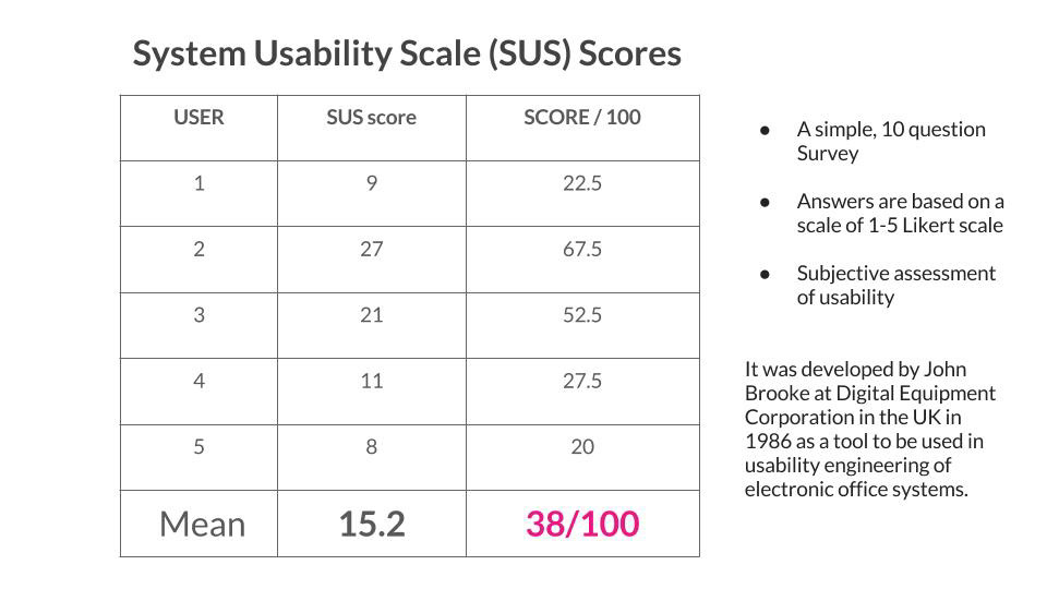
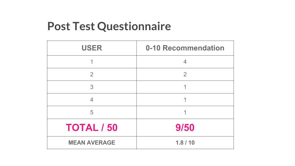
Summative Data
